

Real Estate Roundup
The Delinquency Report

The Memo
To:
The Team
Re:
Real Estate Delinquencies by type
Fannie Mae Statistical Report
Comments:
Delinquency stats:
Residential FHA 11.0%
Residential VA 4.7%
Residential Conventional 2.62% (reported by ICE Mortgage Technology)
Commercial CLO 15.1%%
Commercial CMBS 10.87%
Commercial Loans at all Commercial Banks (Q3-24) 1.49%
That 2.62% is important, because as of right now, as we wait for the Federal Reserve to publish Q4 delinquency rates, they’re showing 1.70% for single family across all banks.
In the meantime, Corporate has questions:
Are we taking FNMA Private?
Sincerely,

Please remember to CC your department team members. I’m sure I forgot someone.
End Memo.
The Delinquency Report
Commercial
Cred iQ is reporting Commercial Real Estate Collaterlized Loan Obligation (CLO) distress rate hit a new high of 15%. It was 8.6% this time last year.

Trepp is reporting CMBS (Commercial Mortgage Backed Securities) overall delinquency of 10.87%. However, they’re also reporting Office CMBS hit 15.11% a new all time high.

Bank Loans:
Residential
Yahoo! finance has this nifty graphic showing delinquency by income range, using that same ICE data, mixed in their story about the current 2.62% delinquency.

I want to take a minute to recommend, to anyone interested in the residential real estate reporting world, to subscribe to Melody Wright’s publication HERE if you don’t already. She’s been light years ahead of industry coverage.
Back to that note about ICE publishing conventional delinquency being up to 2.6%, look at what it was in Q3 of 2007.

FHA
The new “subprime” or to quote ICE in the Yahoo article:
“But what starts as a stressor for less well-off borrowers can often spread, particularly if the job market weakens generally. In a recent report, ICE said FHA and VA loan delinquencies “are likely to serve as canaries in the coal mine” for broader mortgage payment trends during this economic cycle.
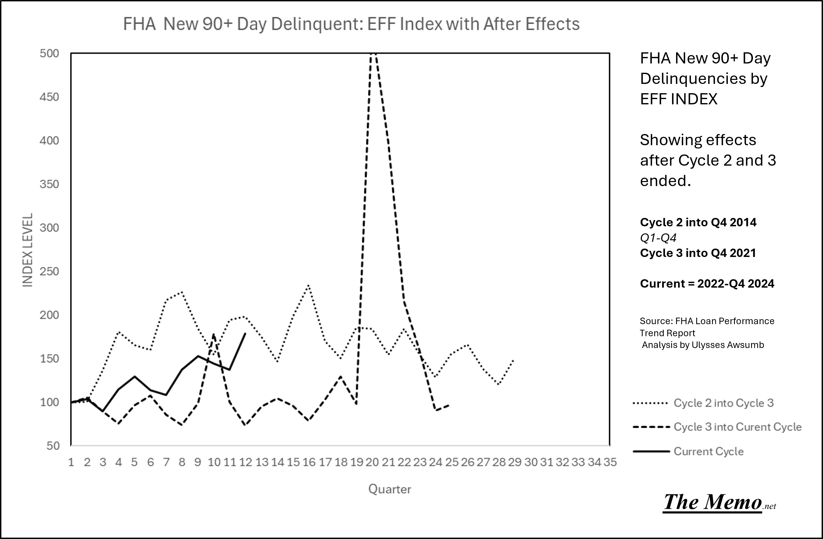
Here’s a look at new 90+ Day delinquencies by quarter for FHA. We have the highest number outside of 2020 (when everything was shut down) ever . Granted there are more FHA loans now, but these are just 90+ day late, not all 1Million + FHA delinquencies.

Aside from all the foreclosure prevention steps put in place since then, the FHFA just published this:

Here’s a look at reasons for new 90+ Day FHA delinquencies.

As I’ve chronicled here, the EFF Index method can give us quite a glimpse into behavioral and economic patters. So here’s the EFF Index version. (Cycle 2 is only available from 2008-2011 instead of 2004-2011) so we’re missing the first 4 years of Cycle 2) and Cycle 2’s index of 100 is Q1 2008. So this will be slightly innaccurate but the trendline is useful.

As EFF index has also shown, 2020’s market mayhem was part of the cycle. Now let’s look past Cycle 2 and 3 into their after effects.
One Quarter later: different picture.
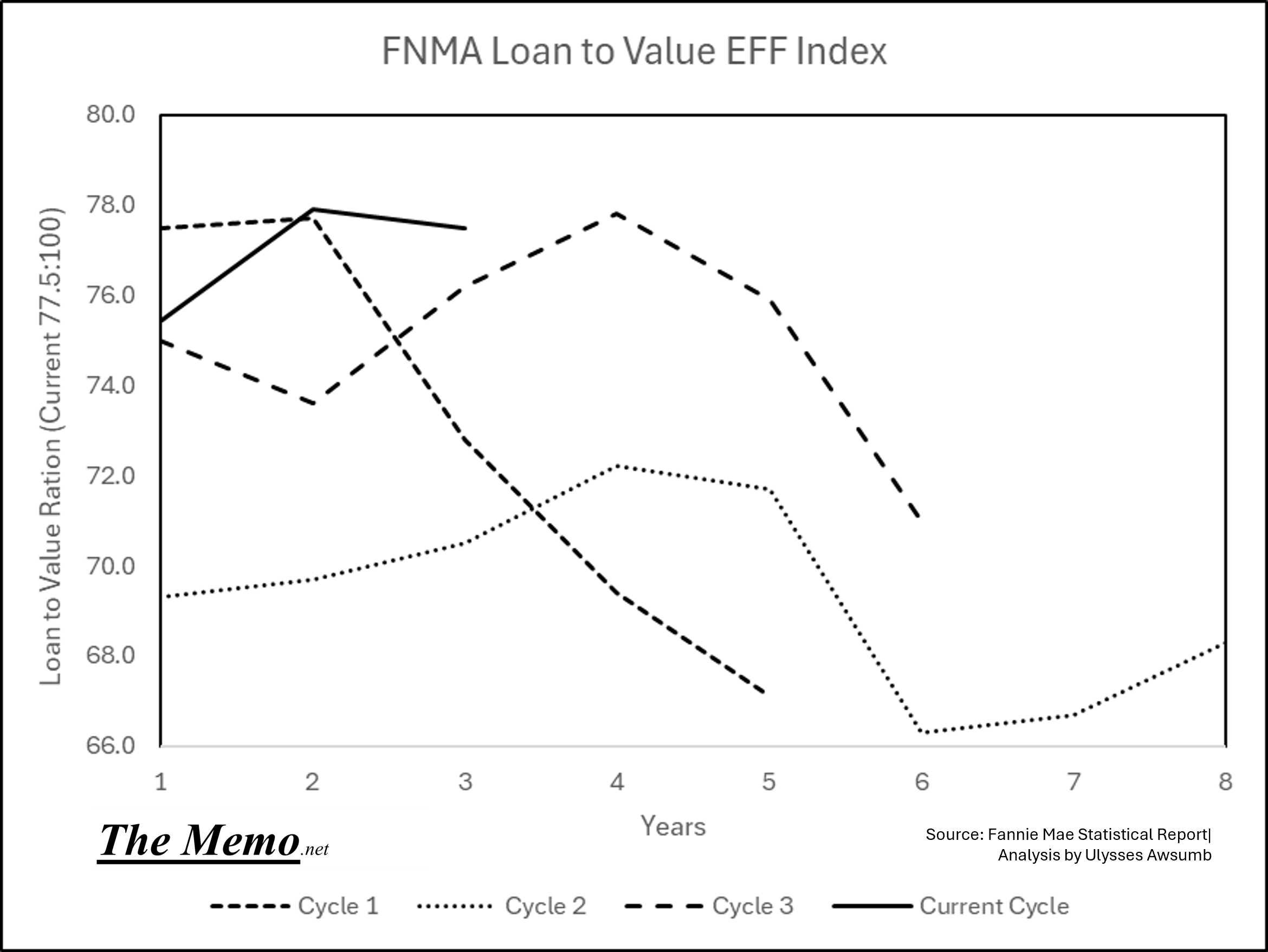
Fannie Mae
The Federal National Mortgage Association, also known as Fannie Mae just published their latest statistical summary tables.
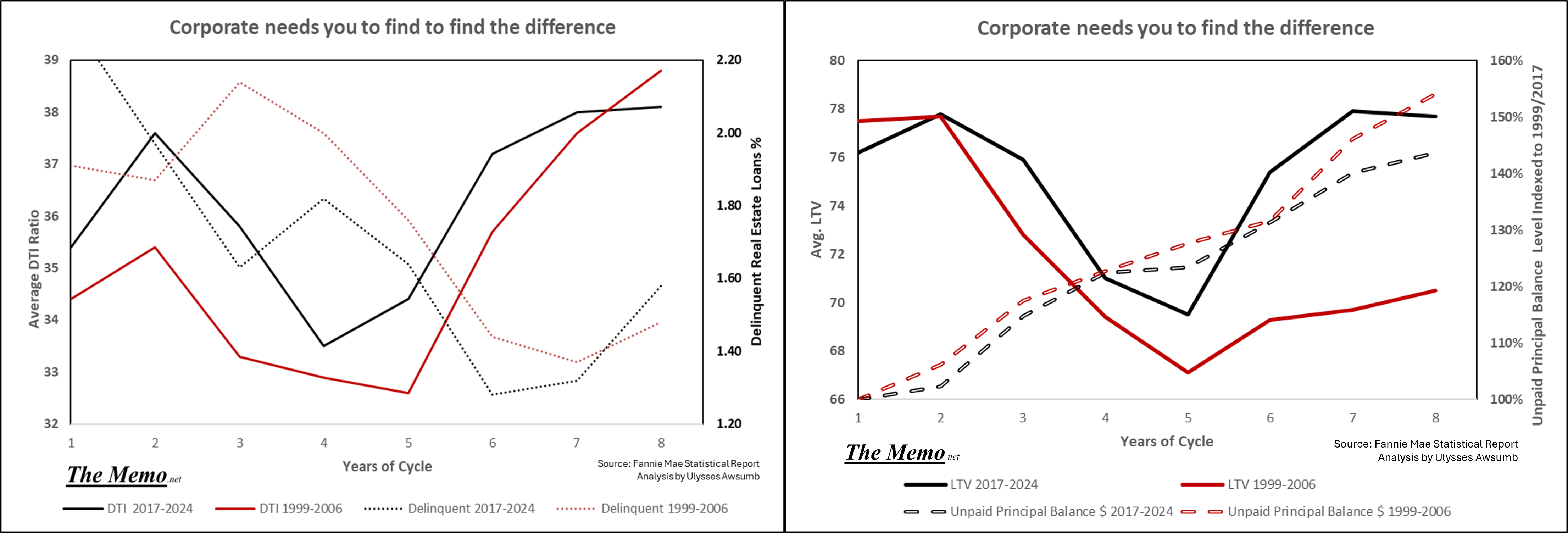
This tracks the statistics of each years loan acquisition portfolio. Outside of total loan counts, the remaining stats are weighted averages. So for instance, the Debt to Income (DTI) of 38.1% for 2024, is the weighted average of their acquired loans. (Loans they purchase from mortgage originators to hold or pool with securities)
On the Left is Debt to Income vs All Loans tied to Real Estate delinquency rate as tracked by the Federal Reserve. On the Right, is DTI vs Loan to Value (78 = 78% loan to value of property)

Anything stand out? Like same Debt to Income profile as 2006 with higher LTV (higher LTV = less equity)
Before we go on, I just want to point out the scale of things. In construction, an architect will design multiple assembly components, and draw them in scale. Note this image, and the SCALE differences?

If you were to draw each design using the same scale, you’d never be able to see some of the important details. Thus scales must change. Looking at each image side by side this way, gives you the ability understand the assembly, while also knowing they aren’t equal size.
Back before the internet existed, before CAD existed, architects hand drew and scaled everything. They had something like a Storypole we discussed here. It’s called an Architectural Ruler. They’re six sided, and each side has a different scale on it, to measure quickly. As in, 3/8” = 1’ on one side, so that side every 3/8” there’s a mark, but the marks are measured as 1,2,3,4 etc. That way you just count in feet for long runs instead of counting how many 1/8’s and converting.
Here’s mine:

I’ve had this thing a while.
I note this, because much like the building plans, charts also have scale. I could put two plans next to one another,
An interior elevation of a 20’ tall floor to ceiling commercial building lobby
A 9’ tall floor to ceiling home interior elevation
And I could see them in the same clarity, but know they’re not the exact same scale.
These next charts show two scales also (Dual Axis), or to use the analogy: Floor to Ceiling of Delinquency % Change Year over Year on the left in black, and Floor to Ceiling of Debt to Income/Loan to Value on the Right in Red. Negative on the left side is the situation improving (think less and less delinquency)
The charts do not include the recently published increase in loan delinquency.


Noticing the similarities and patterns of Expansion, Contraction and Recovery in terms of Debt? By the way, that 38% debt to income is Prime borrowers. So, we can see duress being imposed upon prime borrowers of the last 3 years, as measured by both the amount of their monthly income that goes to paying their debt service (mortgage ) and by the Loan to Value ratio of their home, as DTI, LTV and Delinquency all have risen together. (or in between each recession as that’s “expansion”)
Here’s the EFF Timeline which I contend is the best way to view the situation (most controlled circumstances):

So what gives with The Office joke about Corporate needing you to spot the difference?
Both Time and Distance, are relative, and can be measured in multiple ways. As the EFF Indices show us remarkable timing, so too can we see patterns outside of the EFFing timeline. In fact, one has to look outside of it, because there are time periods that exist outside of the EFF timeline. Rates might sit but the Archetypes do not.
For instance, this chart ceases to be useful because it incorporates the time between rate raises, where rates just sat. In between Cycle 1 & 2 there were 7+ months in 2003/2004 where we can’t use the EFF index because it loses its purpose. And similarly, there were 20+ months between May 2020 and March of 2022 where rates weren’t changing. So this chart here is inaccurately covering time periods that aren’t part of the Index.

The 2001/2020 Recessions had some similarities, in my opinion, neither was directly real estate driven in and of themselves. Given that Fannie Mae available data starts in 1999, I thought I’d just break down the first 8 years, 1999-2006, and last 8 years 2015-2024, where home prices in general began to start increasing faster than they had previously. (Change the scale and the time) Take a look at this time comparison:

So that’s what’s with my Office Joke.


© Deedle-Dee Productions, Universal Television and NBC
Nope, don’t like that at all.
Oh, It’s not just DTI and LTV either.

Unpaid principal balance (at time of origination) = Indexed to 1999/2017 | Delinquency Rates by Federal Reserve Board of Governors
Too much debt leads to:
Housing Affordability Crisis
Speaking of Scale and Time: Ask AI
1979, 1989, 1999, 2005, 2019, 2024


Let’s all have a fantastic week, and reach some goals.
Thank you Bob. I appreciate you giving me another opportunity to read about something I haven't before.
We're right in the middle of the 18.6 year lunar nodal maximum, just like we were last in 2006 and 1988 and 1969 and 1950 and 1932... It won't be too long now.