

The 4th Rate Turning Is Here
Winter arrives


The Memo:
To:
Everyone
Re:
The Seasons, and patterns of NASDAQ (+ Dow Jones and Nikkei 225)
Turning Japanese
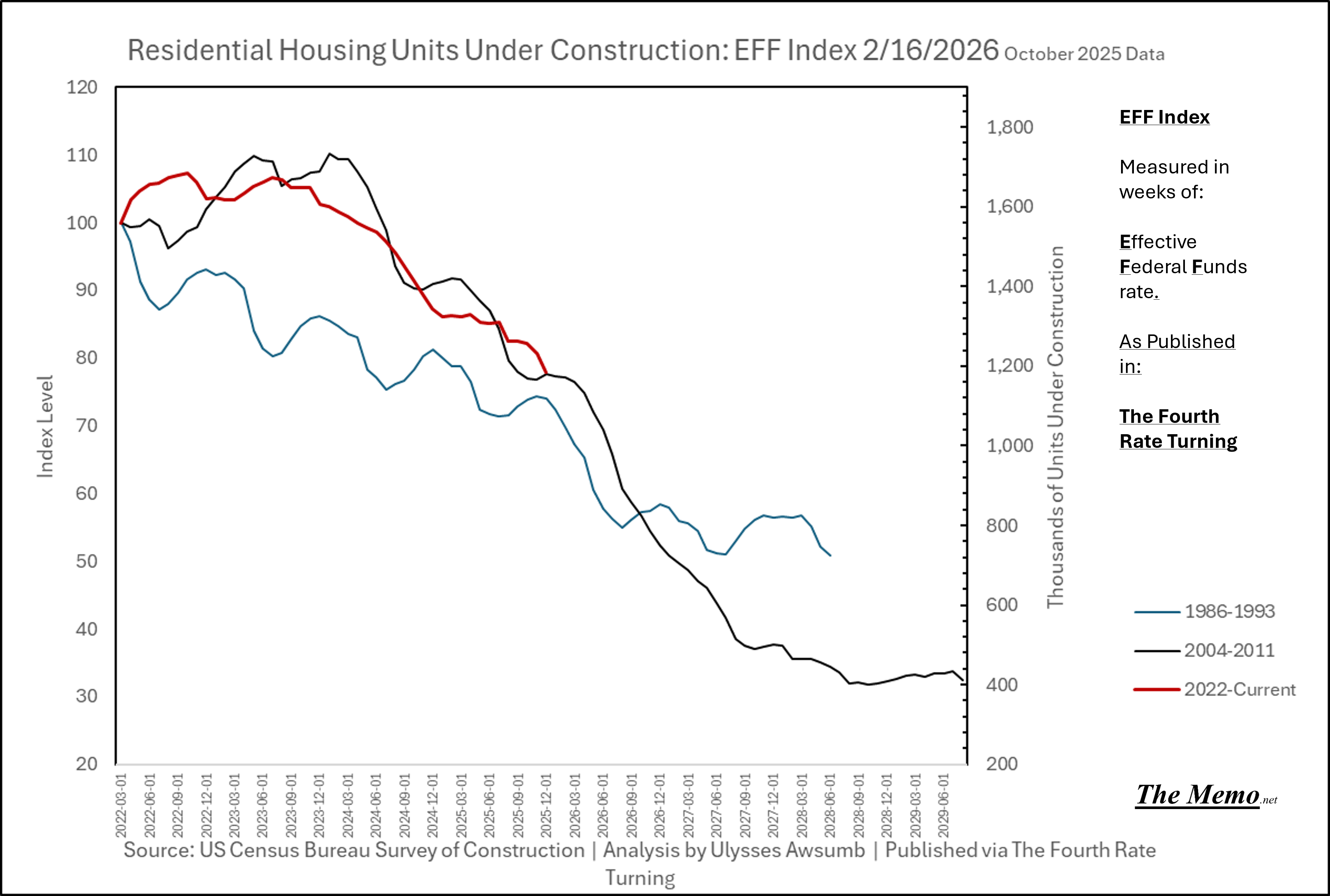
Contract(ion) in Contract(ing). I.E. The decline in Residential Construction
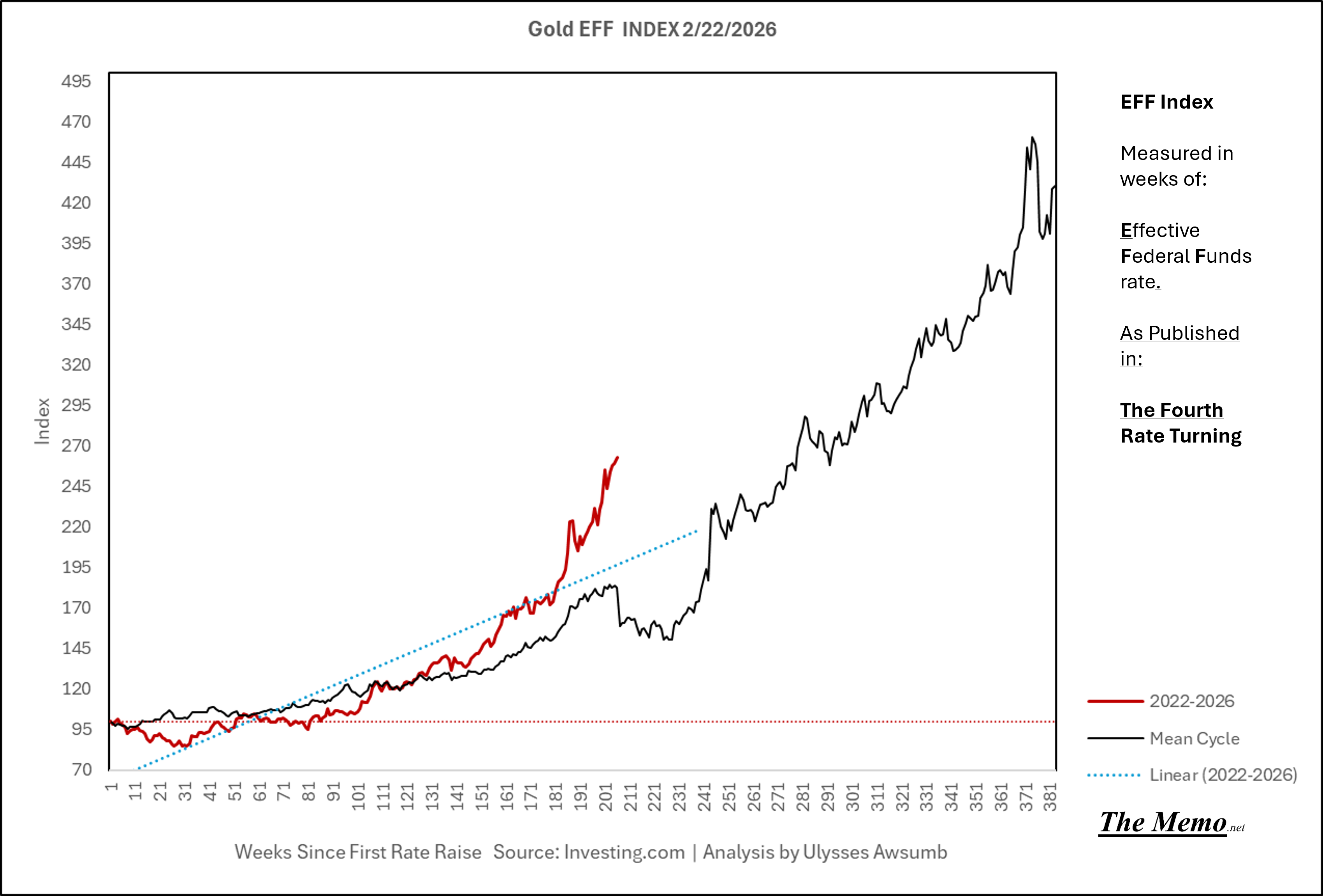
Gold
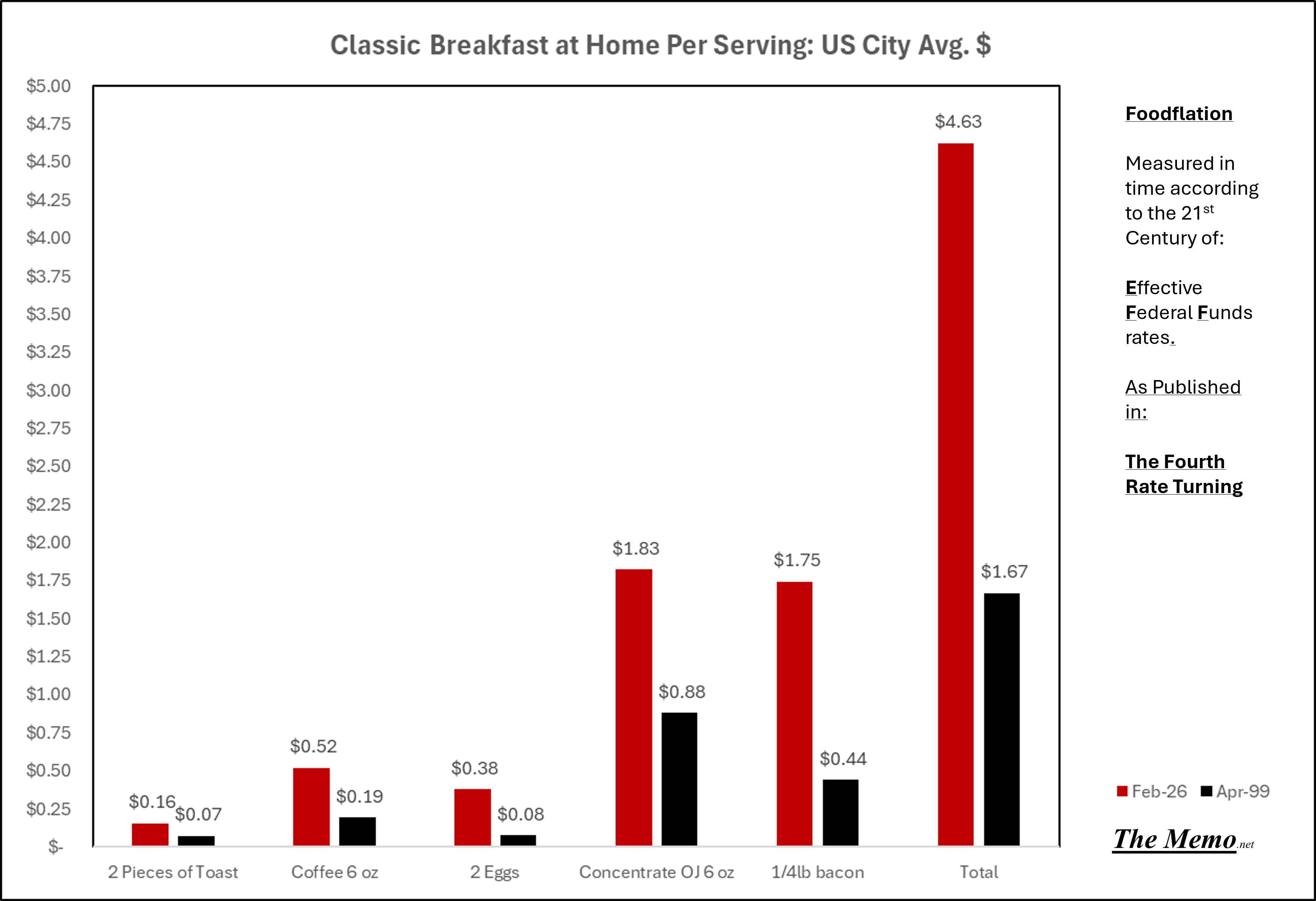
Breakfast: is 277% more expensive than when this Century of EFF Cycle’s started. (+10.65% increase per year annualized) What in the actual EFF………..
It’s all just about the cost of money
Today in EFFing Time
Comments:
Greetings and Salutations. It’s been a minute.
A very warm welcome to all the new folks around here. Thanks for joining the team.
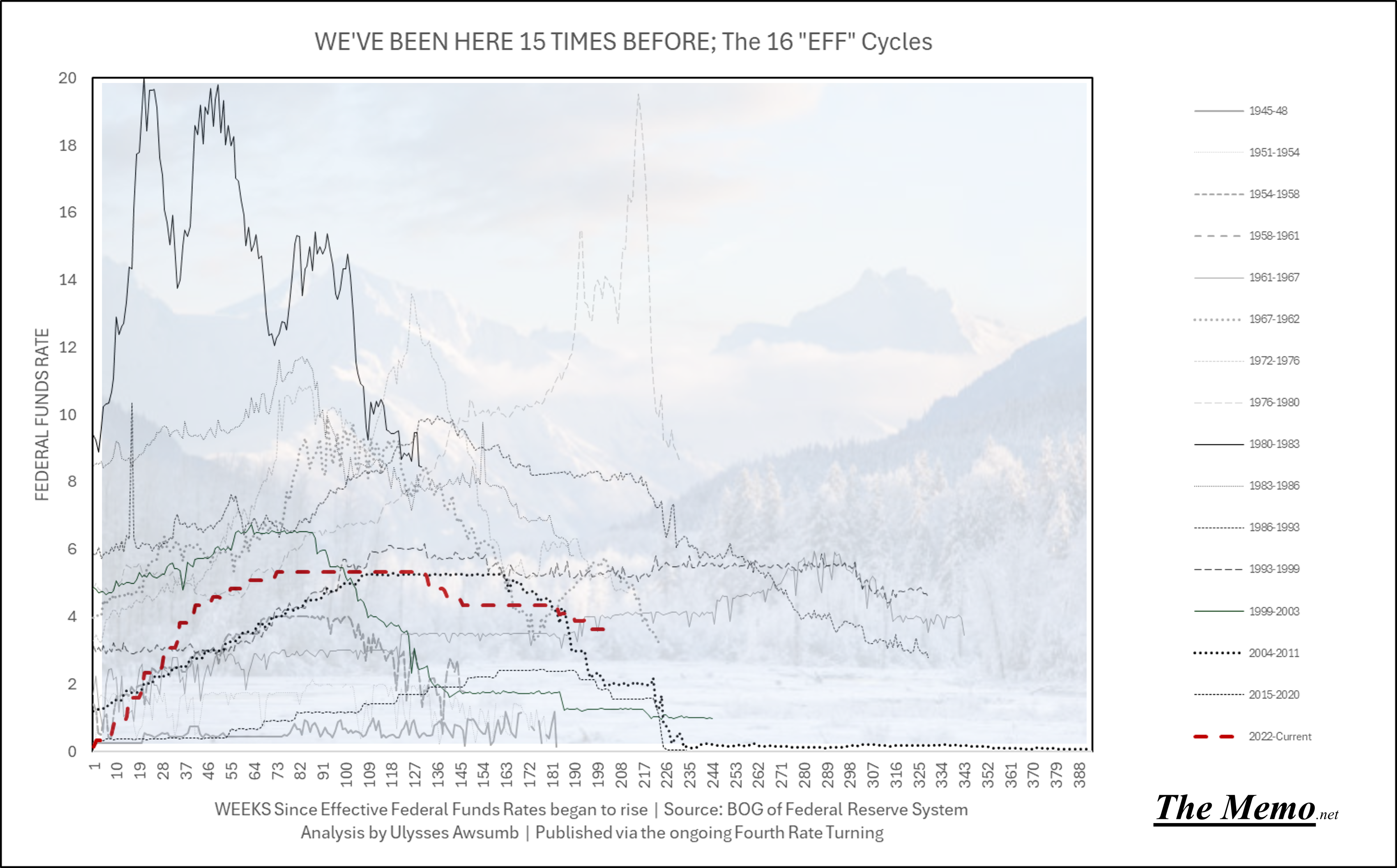
A year and a half ago, I had the notion that we may have the greatest example of a controlled group study in macro-economic history. That being, measuring economic data based on the cyclical changes in Effective Federal Funds Rates. I had no idea what to expect other than I thought I may find some similarities, and the curiosity of studying something I hadn’t ever found anyone else doing, publicly to my knowledge. I used the concept of the “Fourth Turning” because we are undergoing the 4th rate turning (of fed funds) since the start of the new century. Which was my only intention to study (this century).
I would later find the framework of the Fourth Turning could actually apply across the spectrum of Effective Federal Funds cycles going back to Bretton Woods in 1944. With some evidence that it could possibly go back at least to the Civil War. Talk about controlled focus group study results.
To recap, what I’ve wrote at length about (in shorter memos, and definitely funnier memos, if I do say so myself):
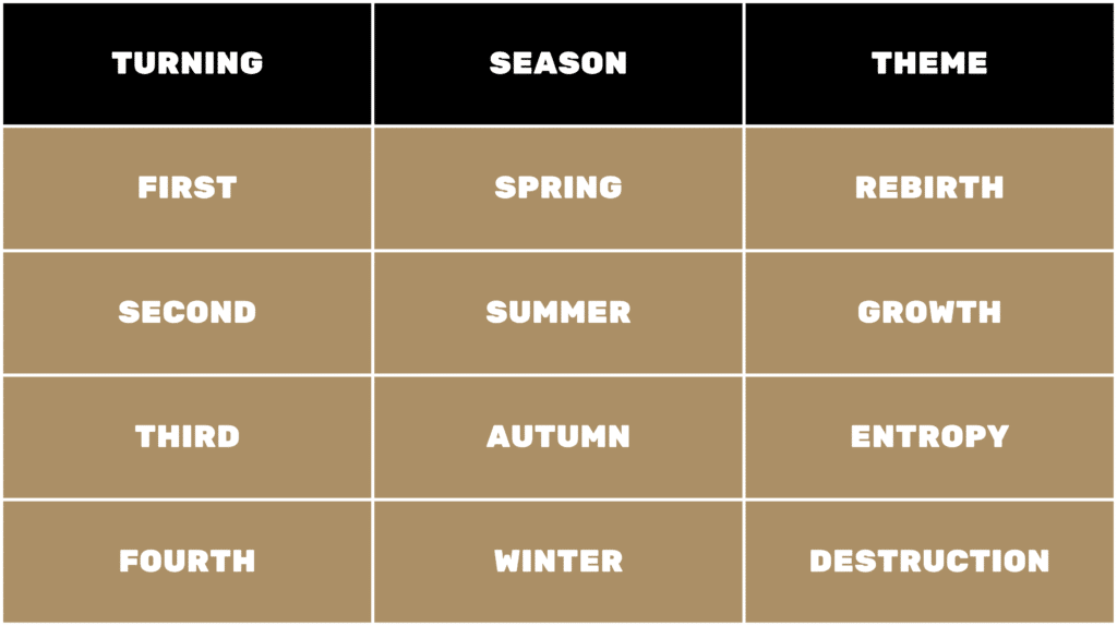
We’ve experienced 15 Effective Federal Funds Cycles since 1944. Each cycle has a:
Spring
Summer
Fall
Winter
They can be summed up as: Initial Reaction to EFFR (effective federal funds rate) changes, Growth despite of EFFR Changes, Stagnation/Inability to further grow as EFFR tops, and outright contraction even as EFFR chases said contraction.
The Mean cycle time going back to 1944 is 238 Weeks. Or 4 1/2 Years. The Median cycle time is 225 weeks, or 4 3/10ths Years. So 4 Cycles is roughly 20 years.
(4 1/2Years x 4 =18)
Coincidentally, Neil Howe’s Fourth Turning seasons average 20 years each, or roughly 80 years start to finish. Each of those seasons represents:
So the 1st turning was roughly 1944-1964ish (Post WWII-JFK Assasination/Vietnam/Civil Rights Movement in 68), The 2nd being 1964-1984ish (Vietnam-Nixon Shock/Farm Bust/Plaza Accords), the 3rd being 1984-2004ish (WTO/Dot Com/Patriot Act/Afghanistan War longer than Vietnam) and the 4th being 2004-now ish. (Post GFC, Financial repression, ZIRP, populism, COVID, AI and the normalization of troops in American Cities). Not perfect 20 year time stints, but the concept remains intact.
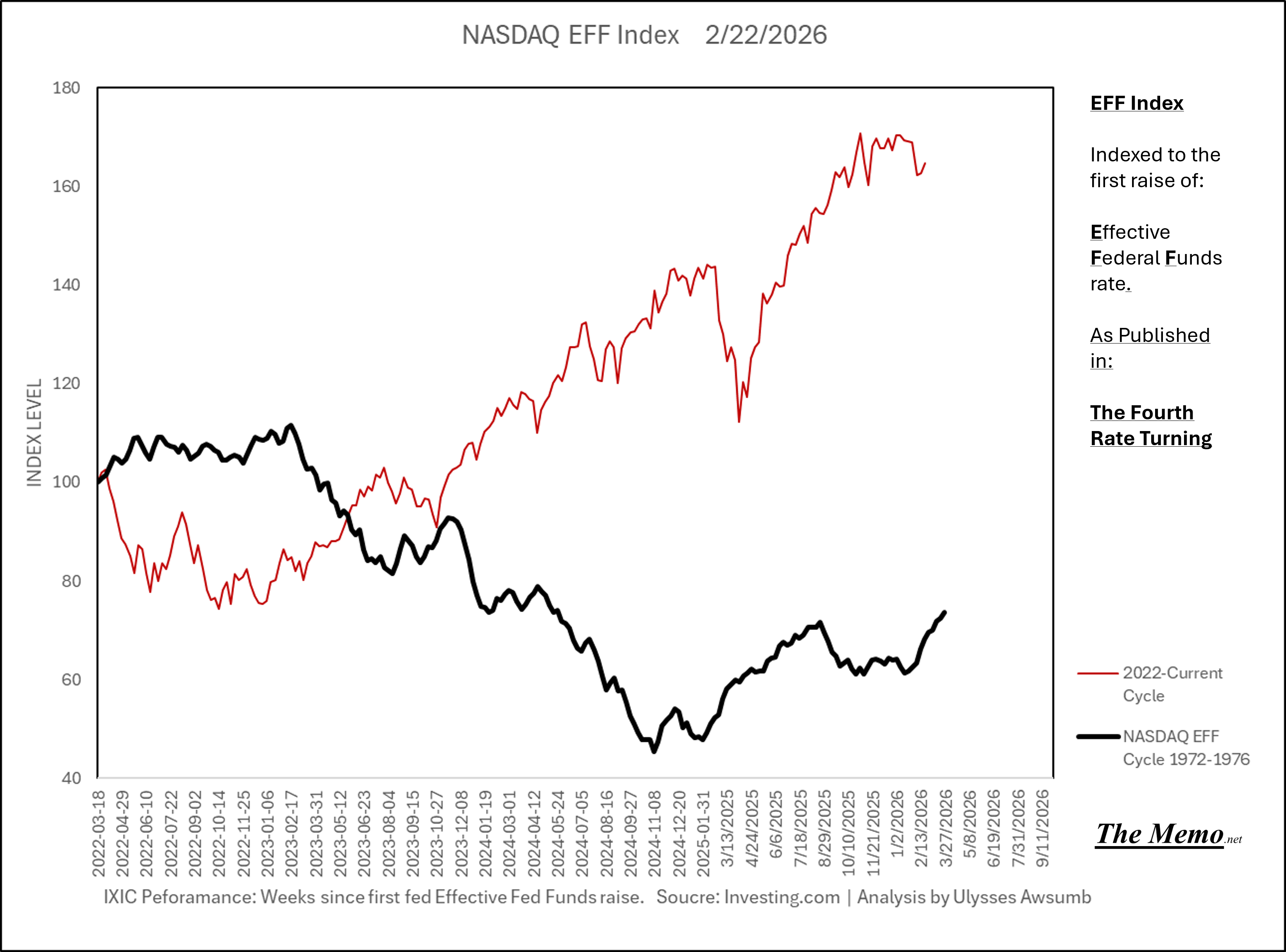
We are currently living in the 208th week of the current cycle. Read on as the weather just changed.

End Memo:
One Of The Three Most Important People in the World: It’s you!
Ted: Yeah! It’s us!
to Bill
Ted: Who are we?
the strangers start playing air guitar, so Bill and Ted play also; more people come out and join them
Ted: Bill, I think they want us to say something.
Bill: What should I say?
Ted: [shrugs] Make something up.
Bill: Be excellent to each other.
room murmurs appreciatively
Ted: Party on, dudes!
room approves
Bill: [to Ted] Good one, dude.
to room
Bill: Well, we gotta get back to our report.
Ted: Yeah. We’d take you with us, but it’s a history report, not a future report.
Bill: Later.
The Three Most Important People in the World: Later.
The Report
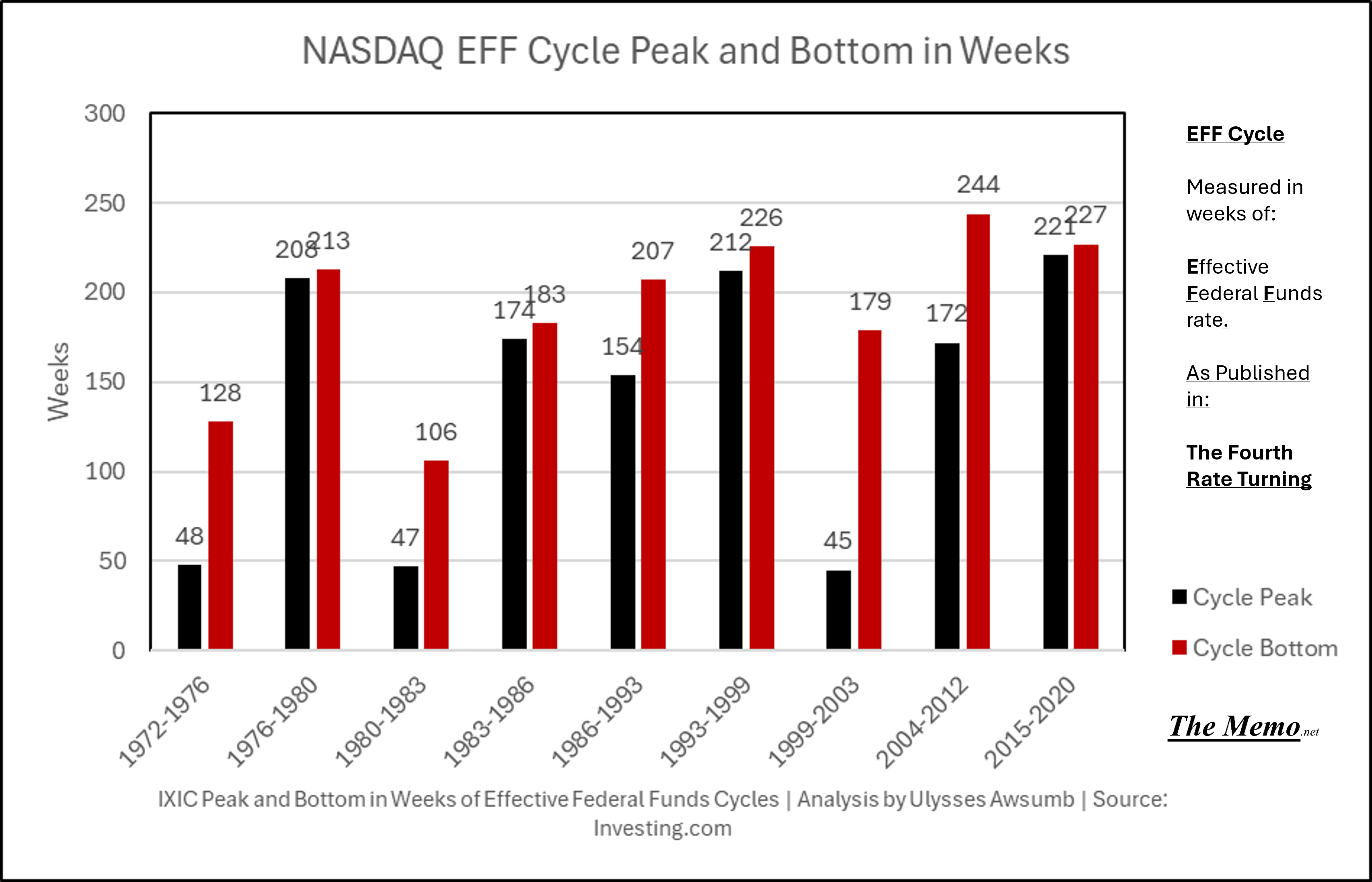
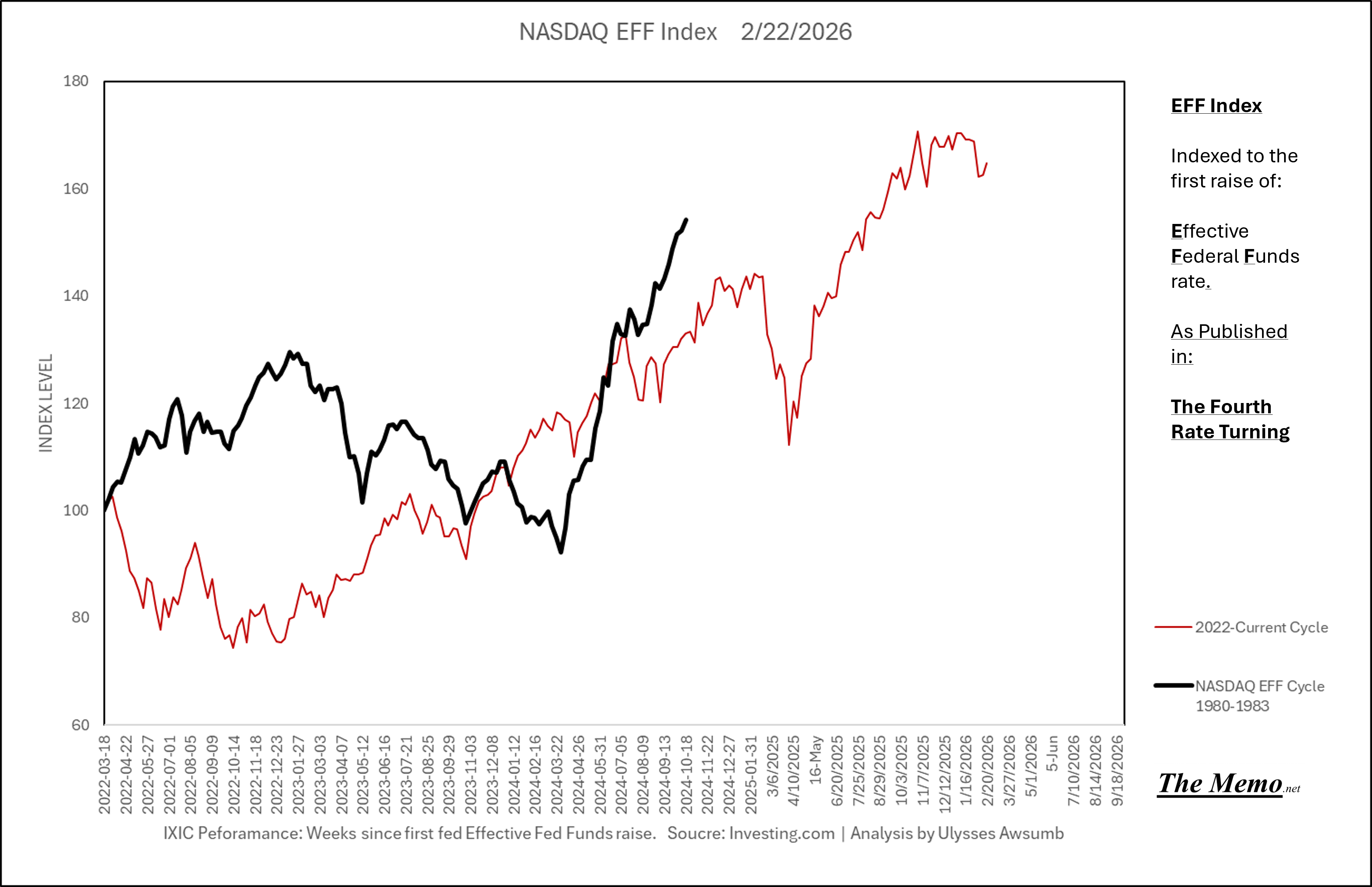
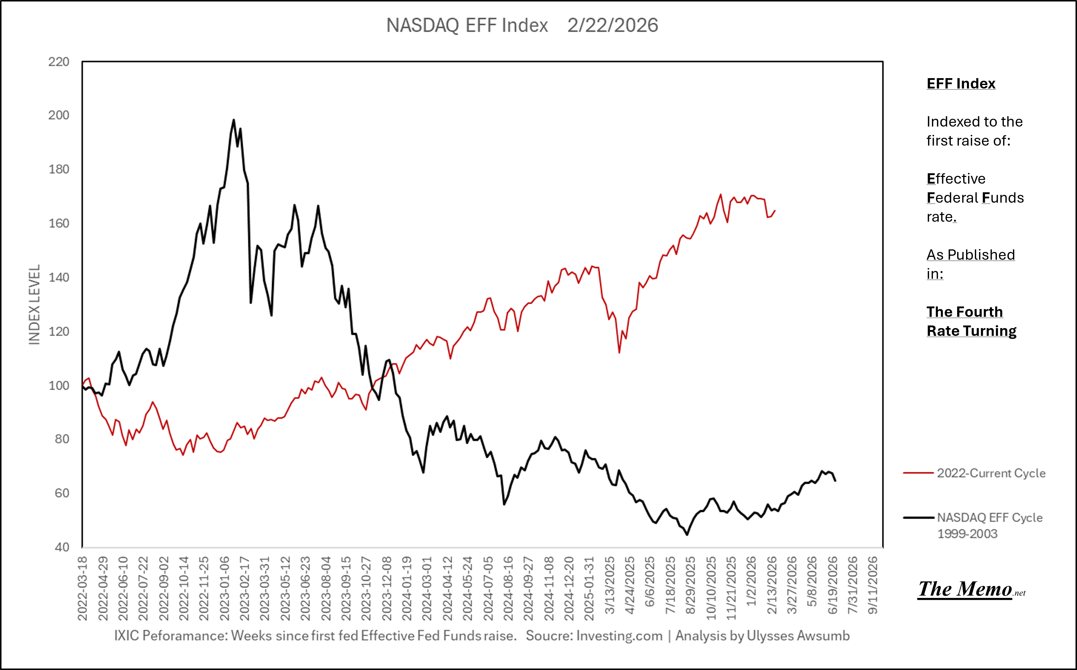
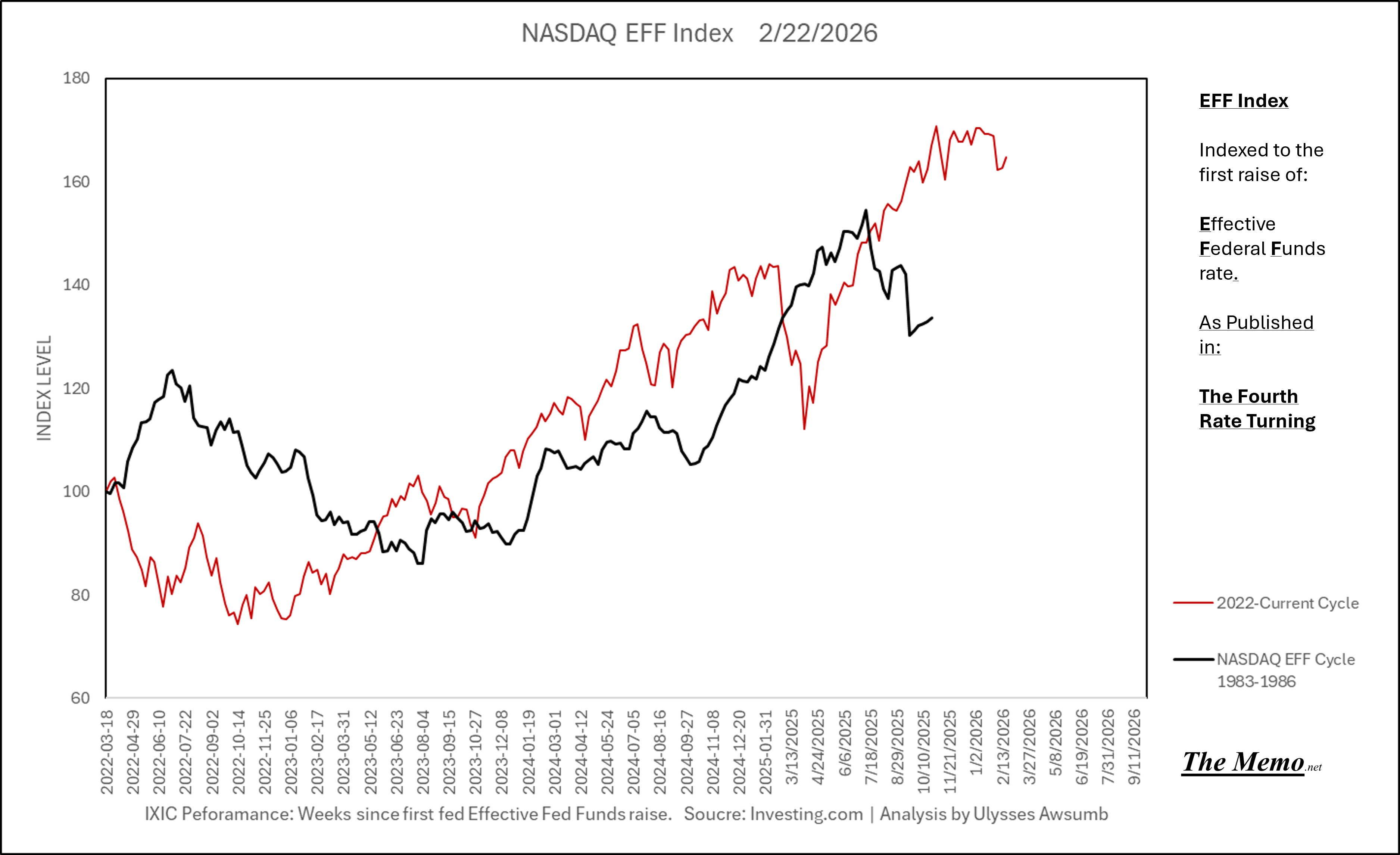
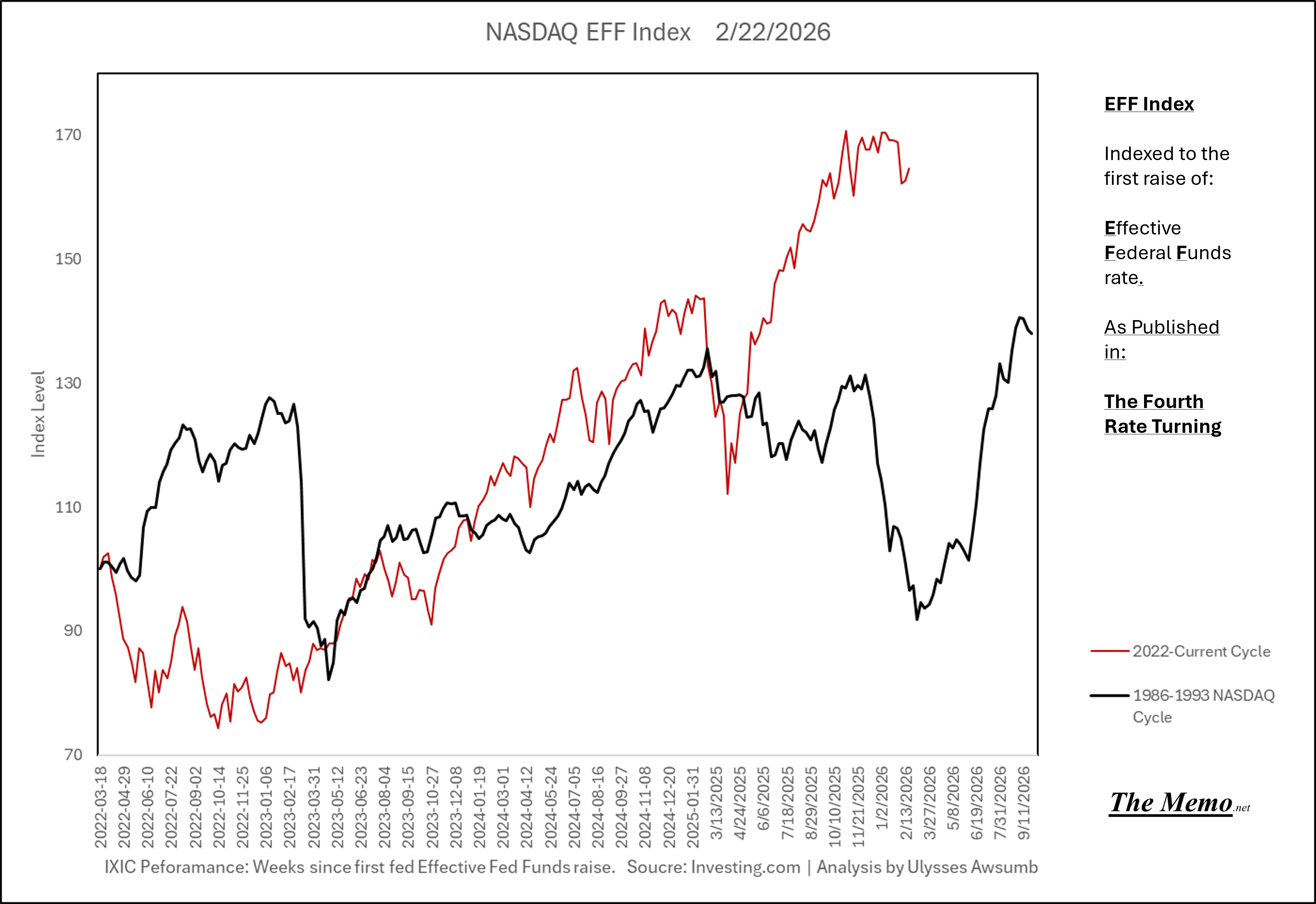
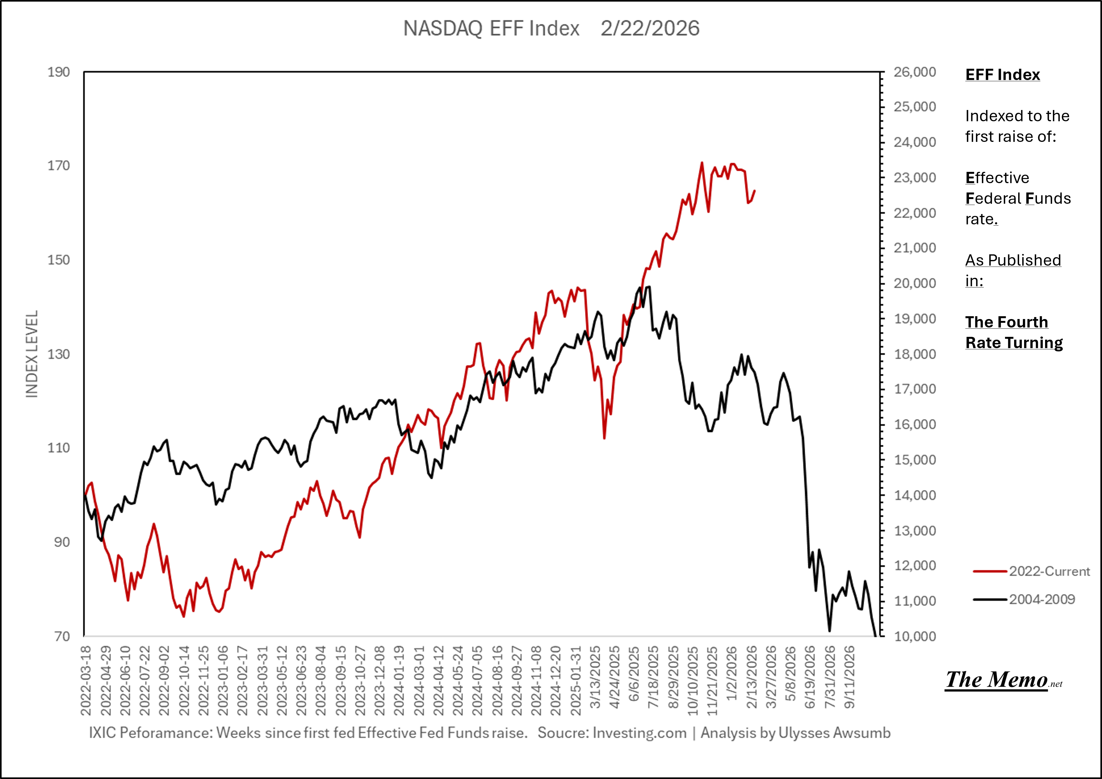
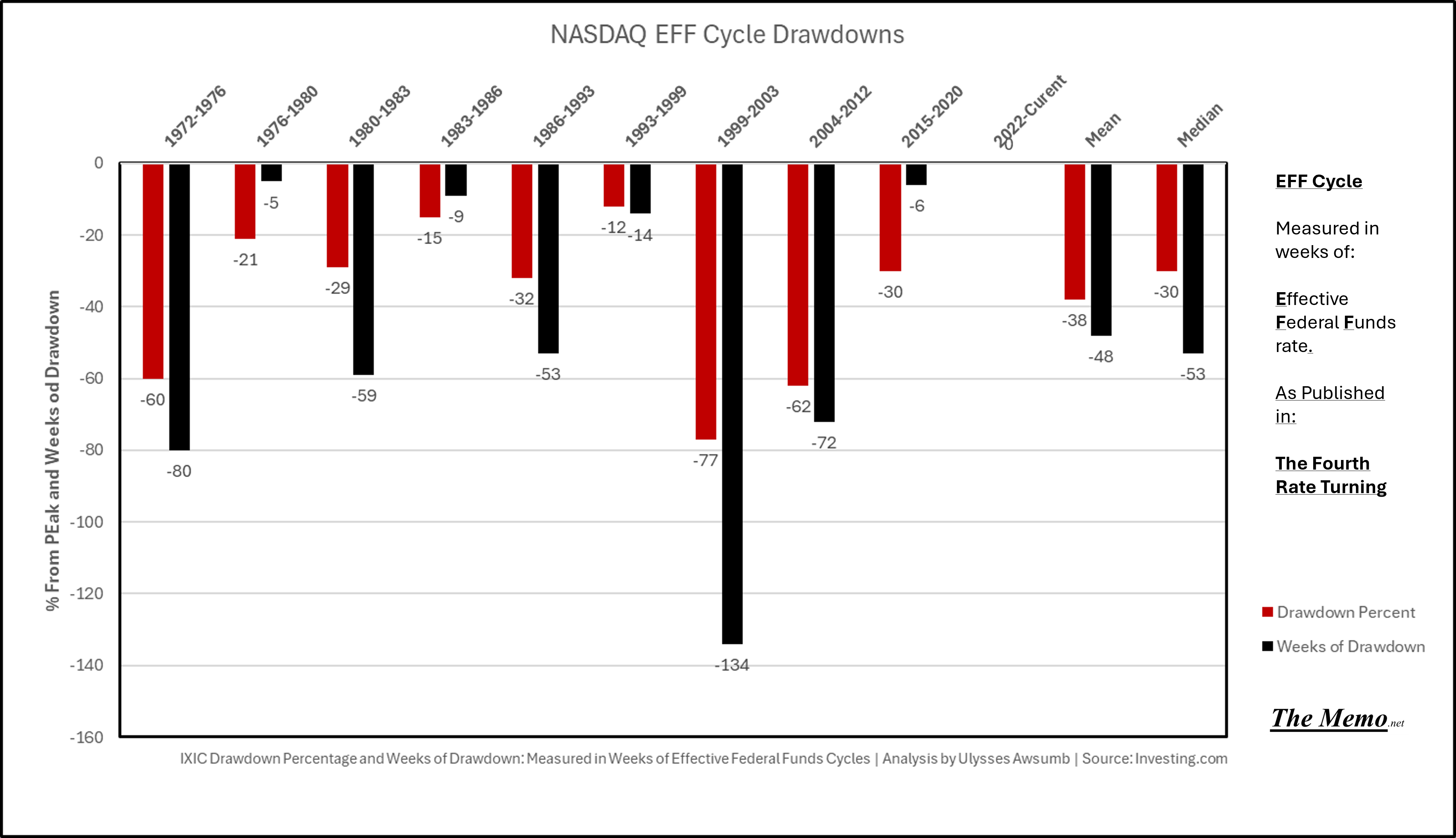
Let’s take the framework we discussed, and apply it to the NASDAQ. Each cycle has its four seasons. The fourth of which, winter, can be summed up as “destruction”. Or in money management terms, bull/bear markets. Each cycle and it’s seasons, as I’ve written about here, have associated Peaks and Troughs (bottoms) in NASDAQ terms. Winter, being the biggest drawdown/bear market territory of each, prior to resetting and growing again.
Here are the last 9 cycles (going back almost to NASDAQs inception). 1972-1976 being the first measurable EFF Cycle in terms of NASDAQ. This chart represents the weeks that markets Peaked and the week they bottomed/troughed before recovery and a new spring.
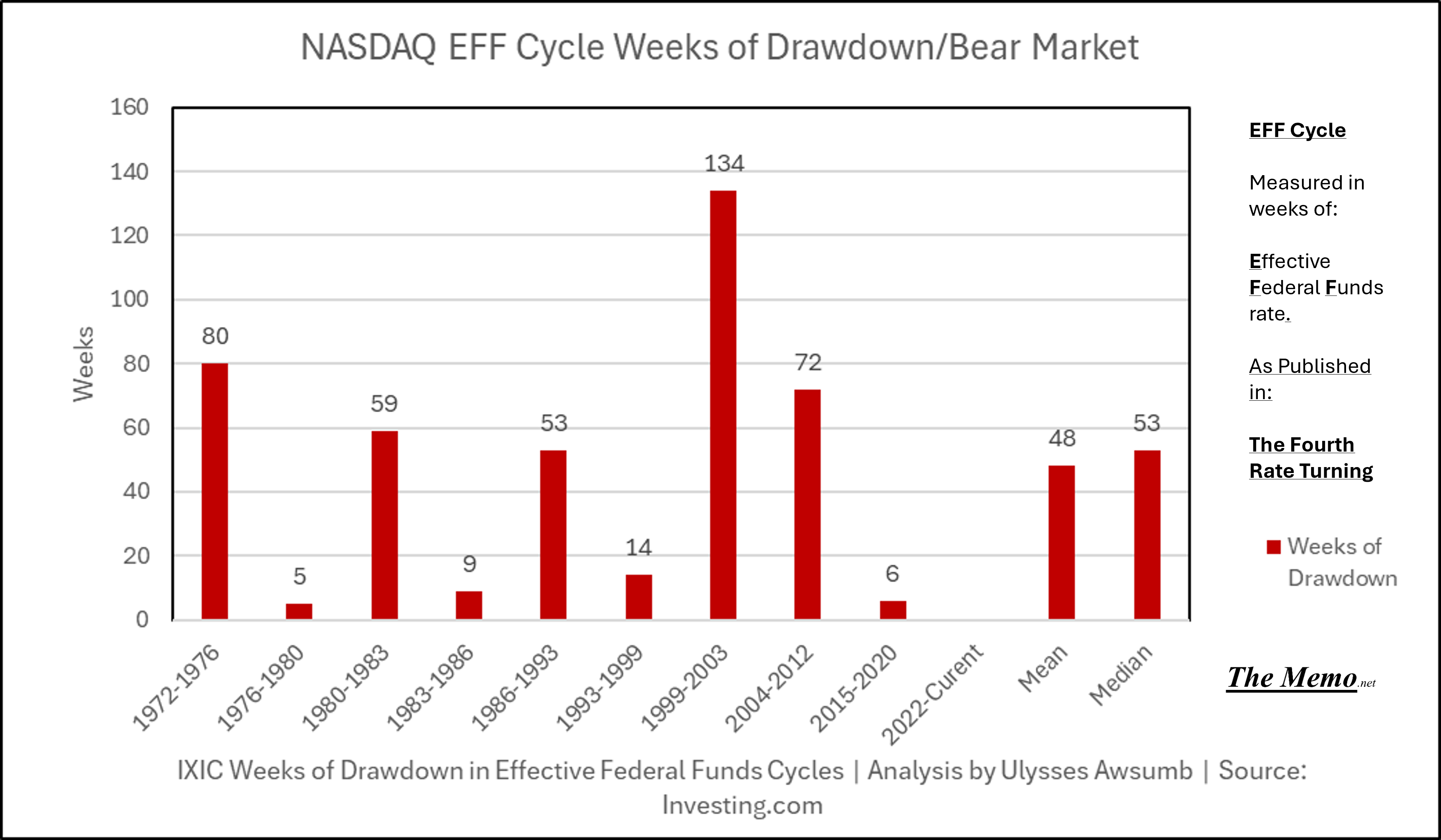
This chart shows the number of weeks of drawdown/bear market corresponding to each cycle.
I’ve broken them down into 3 most similar types. As measured by weeks into the cycles.
Early Peaks:
1972-1976 Peak at 48 weeks with 80 weeks of drawdown -60%
1980-1983 Peak at 47 weeks with 5 weeks of drawdown -29%
1999-2003 Peak at 45 weeks with 134 weeks of drawdown -77%
Mean Drawdown of 55%
Late Mid Cycle Drawdowns
1983-1986 Peak at 174 weeks with 9 weeks of drawdown -15%
1986-1993 Peak at 154 weeks with 53 weeks of drawdown -32%
2004-2012 Peak at 172 weeks with 72 weeks of drawdown -62%
Mean Drawdown of 36%
>Late Winter: 200+ week Late Drawdowns
1976-1980 Peak at 208 weeks with 5 weeks of drawrdown -21%
1993-1999 Peak at 212 weeks with 14 weeks of drawdown -12%
2015-2020 Peak at 221 weeks with 6 weeks of drawdown -30%
Mean Drawdown of 21%
Overall:
Mean Drawdown-38% over 48 weeks
Median Drawdown -30% over 53 weeks
Here’s what they look like in chart groupings:
Early Peaks
150-200 Week Peaks
>200 Week Peaks
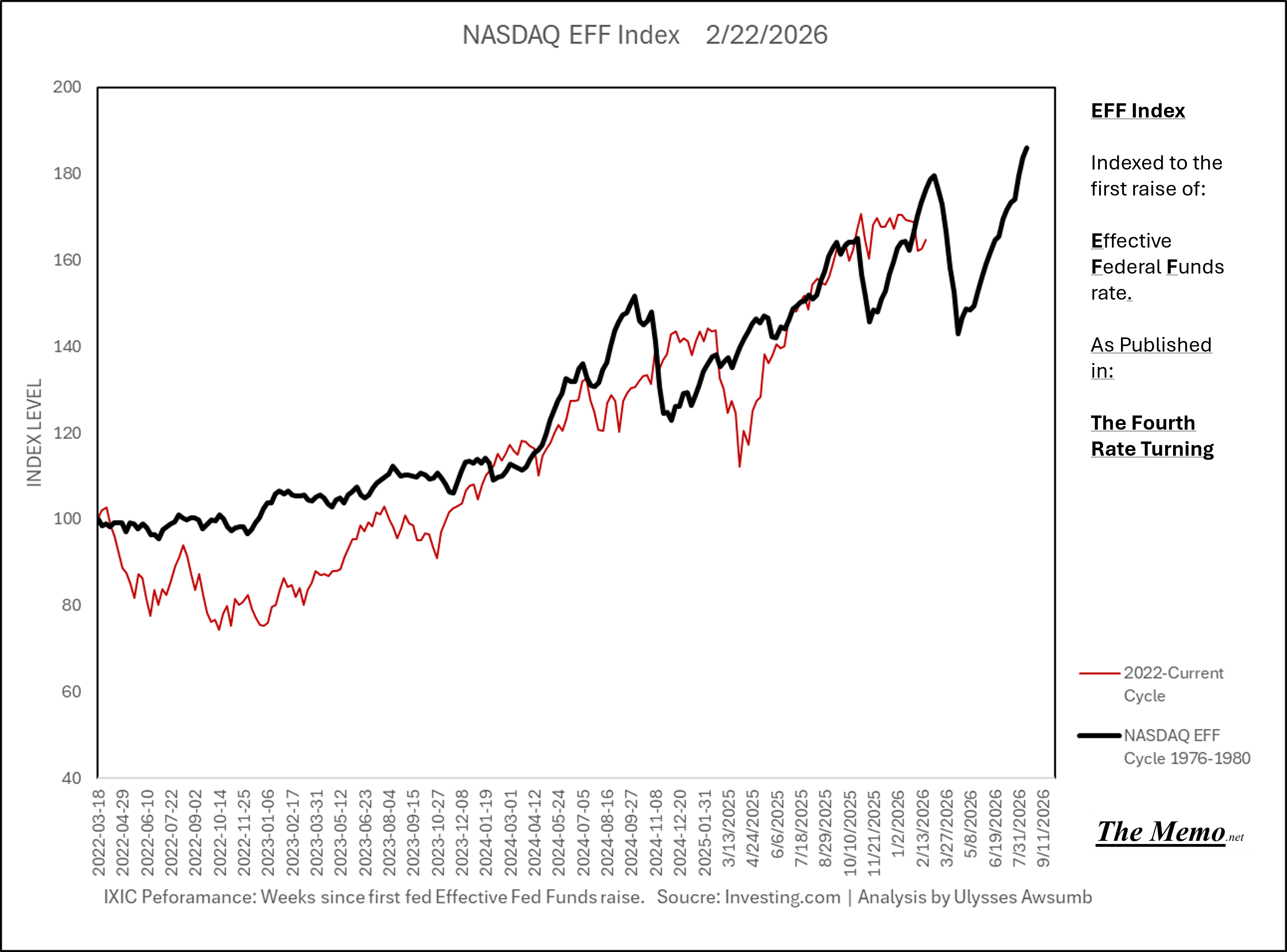
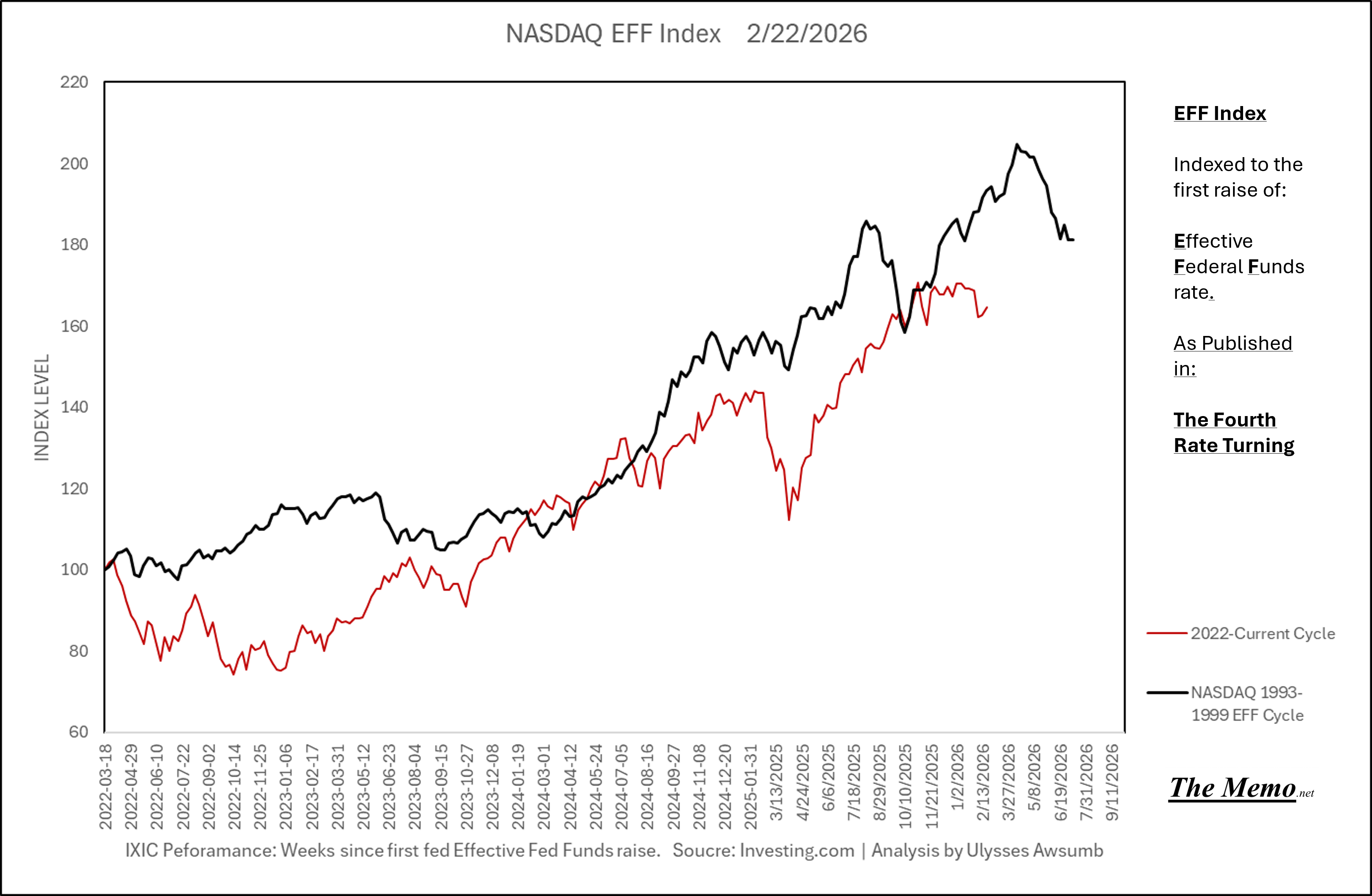
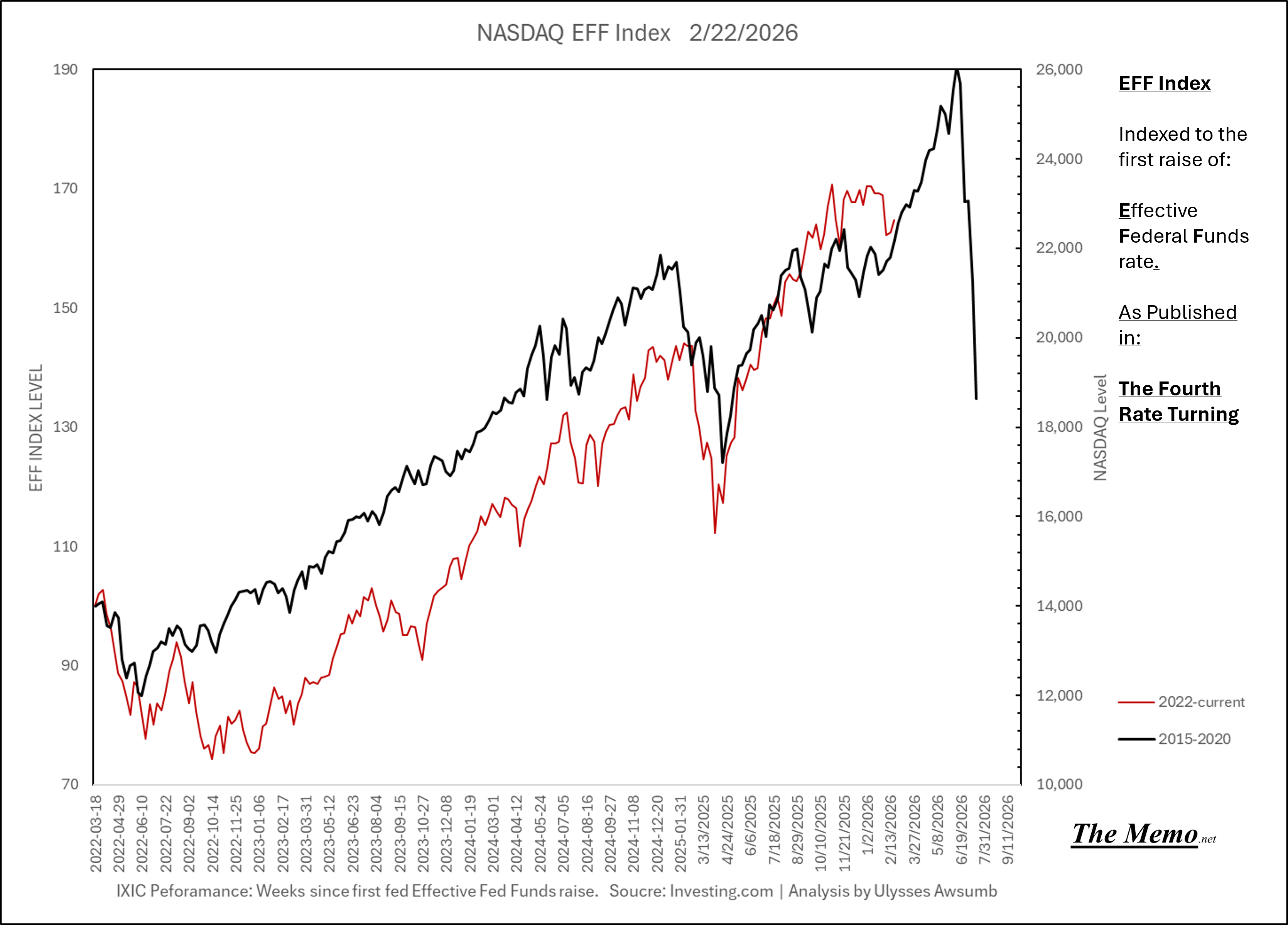
We can eliminate “early drawdowns” from the past equation as most similar to today.
That leaves, as Duder said “Best two out of three”
And, while the charts showing peaks at > than week 200 would lend the possibility of a big spike in NASDAQ level prior to it’s eventual fall (bottom at July 4th 2026????) I feel the need to remind us all that NASDAQ hasn’t made a new ATH (all time high) since October 28th 2025. Or the 190th Week of the cycle. Which is < than 200 weeks. Which would mean things have further to fall sooner. Based on average of the broken out cycles as mentioned, the next drawdown should see between -20-30%
But, bottom still by July 4th 2026?????? What kind of EFFing timeline is this anyway?
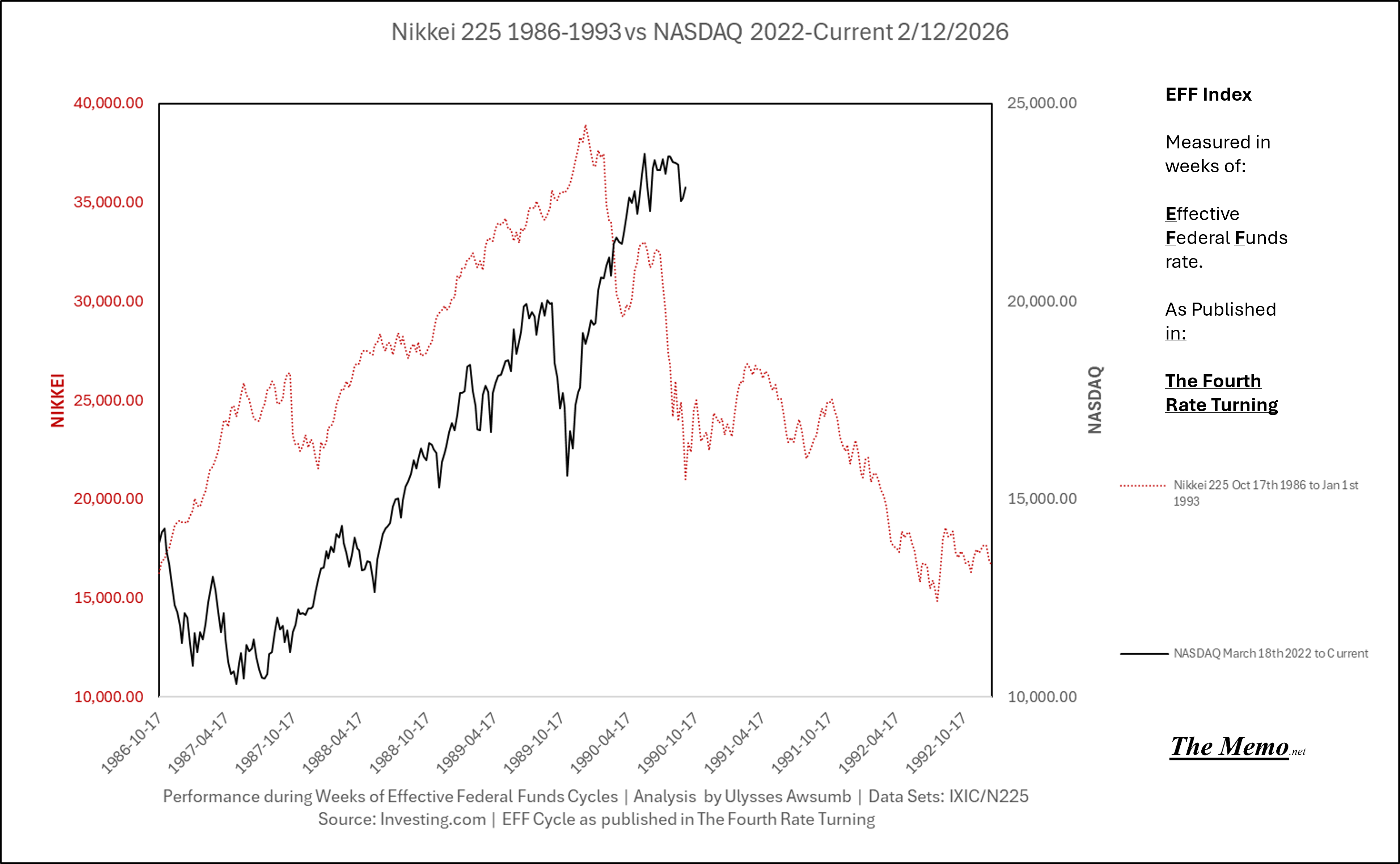
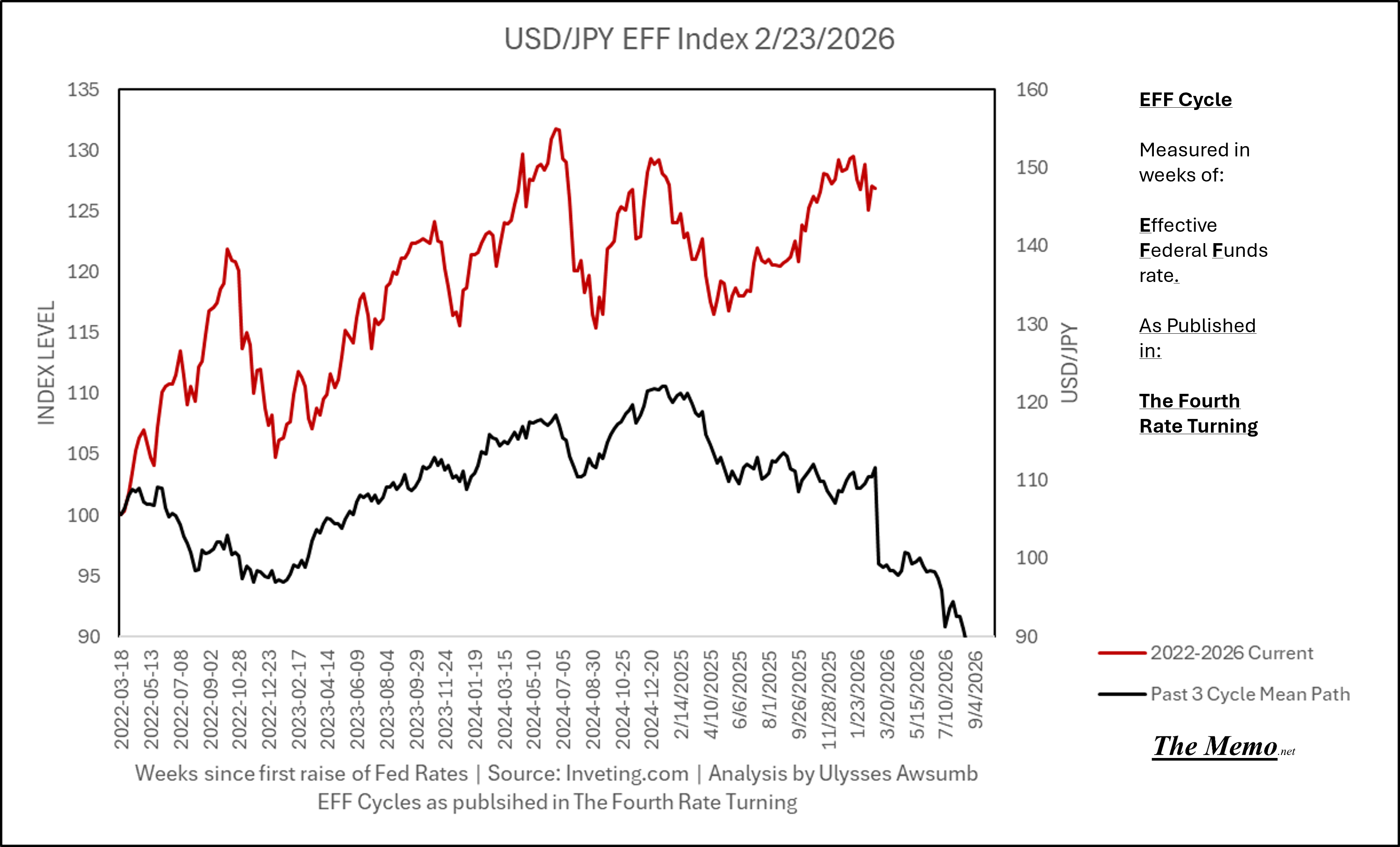
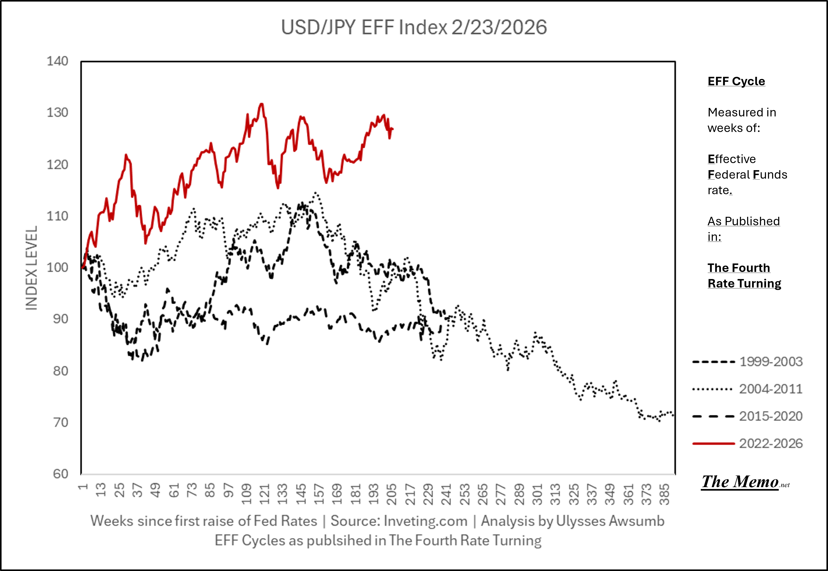
Turning Japanese (while still loving the US and Ulysses)
The current day USA bears some resemblances to pre “bubble” burst Japan. This has been well documented by the good folks at MacroEdge at lenght.
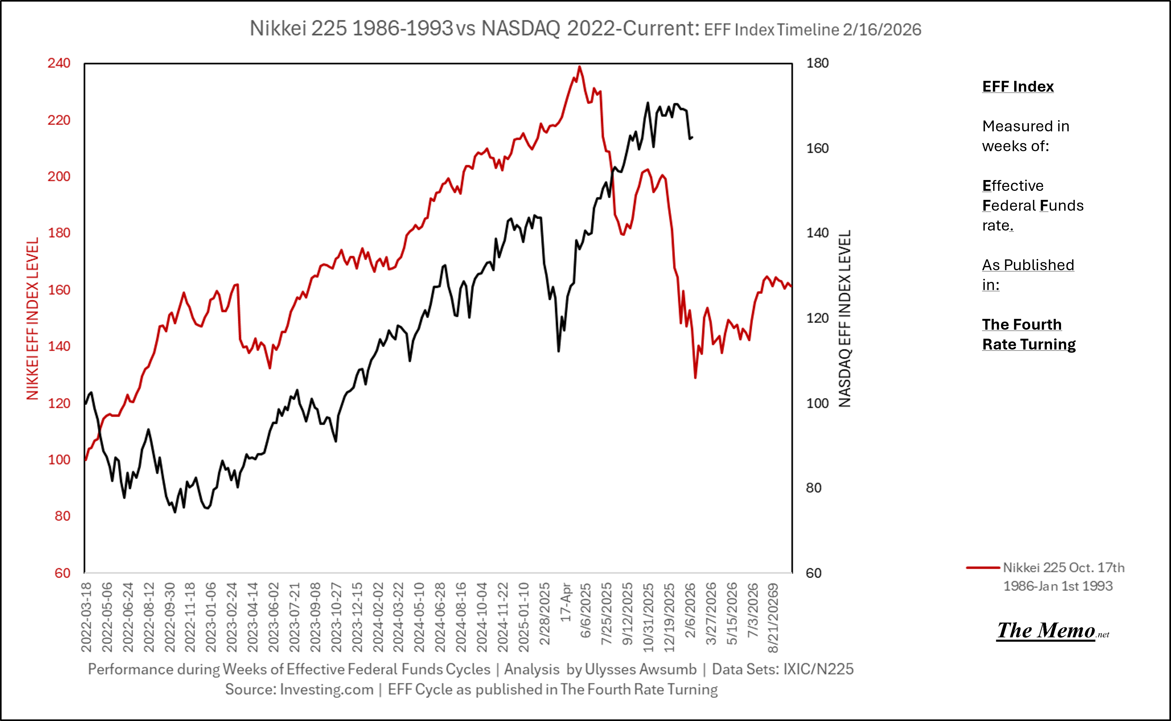
Using the EFFing timeline (Effective Federal Funds Cycles, for the new folks) comparing today’s NASDAQ to the 1985-1993 Nikkei Cycle, there’s some remarkable resemblances.
This chart shows the two in their natural index levels.
While this one puts them into their EFFing Index place.
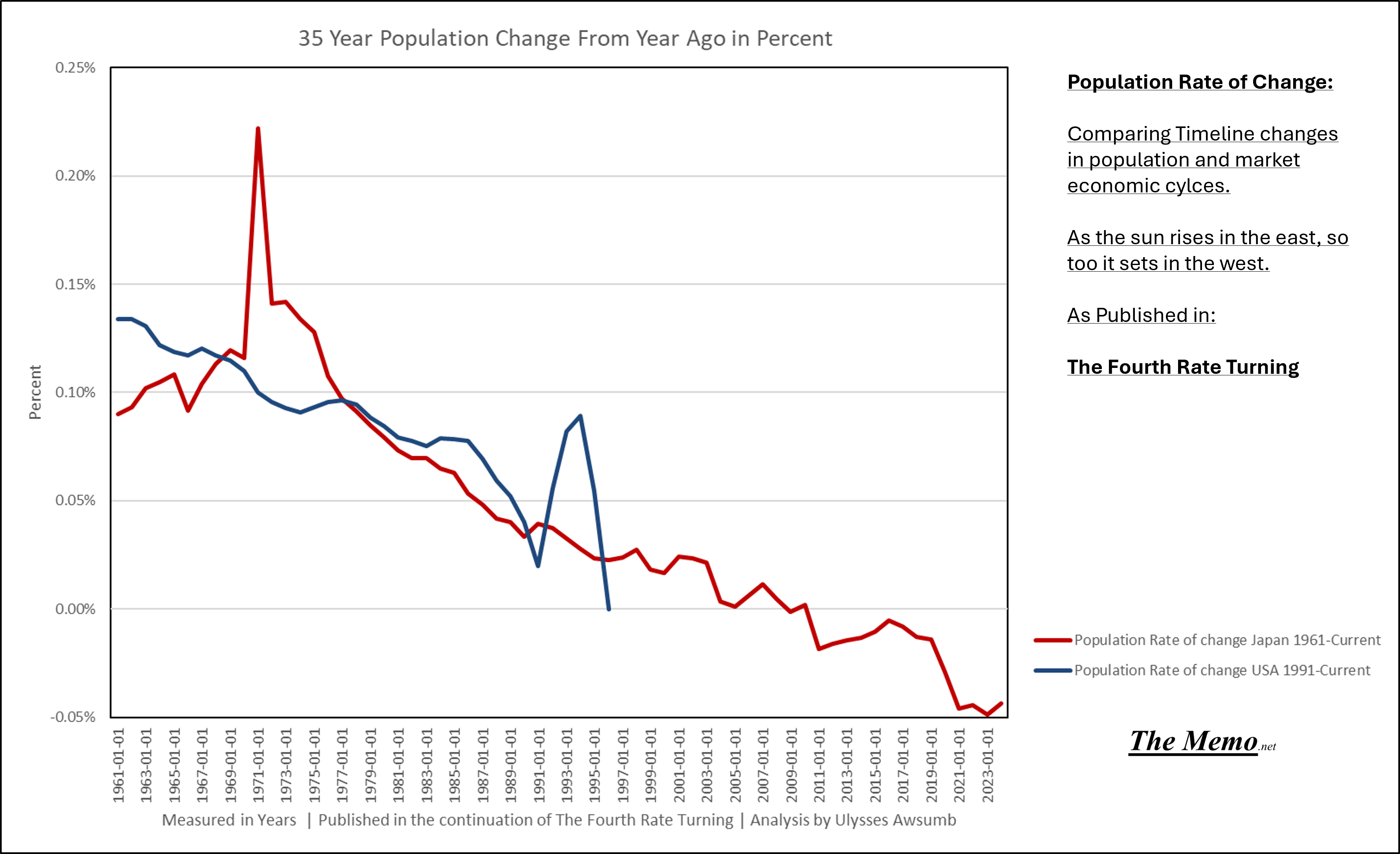
But that’s not the only similarity. Let’s take a look at a 35 year timeline of population rate of change.
Below: Japan 1961-1996 vs USA 1991-2025 (current)
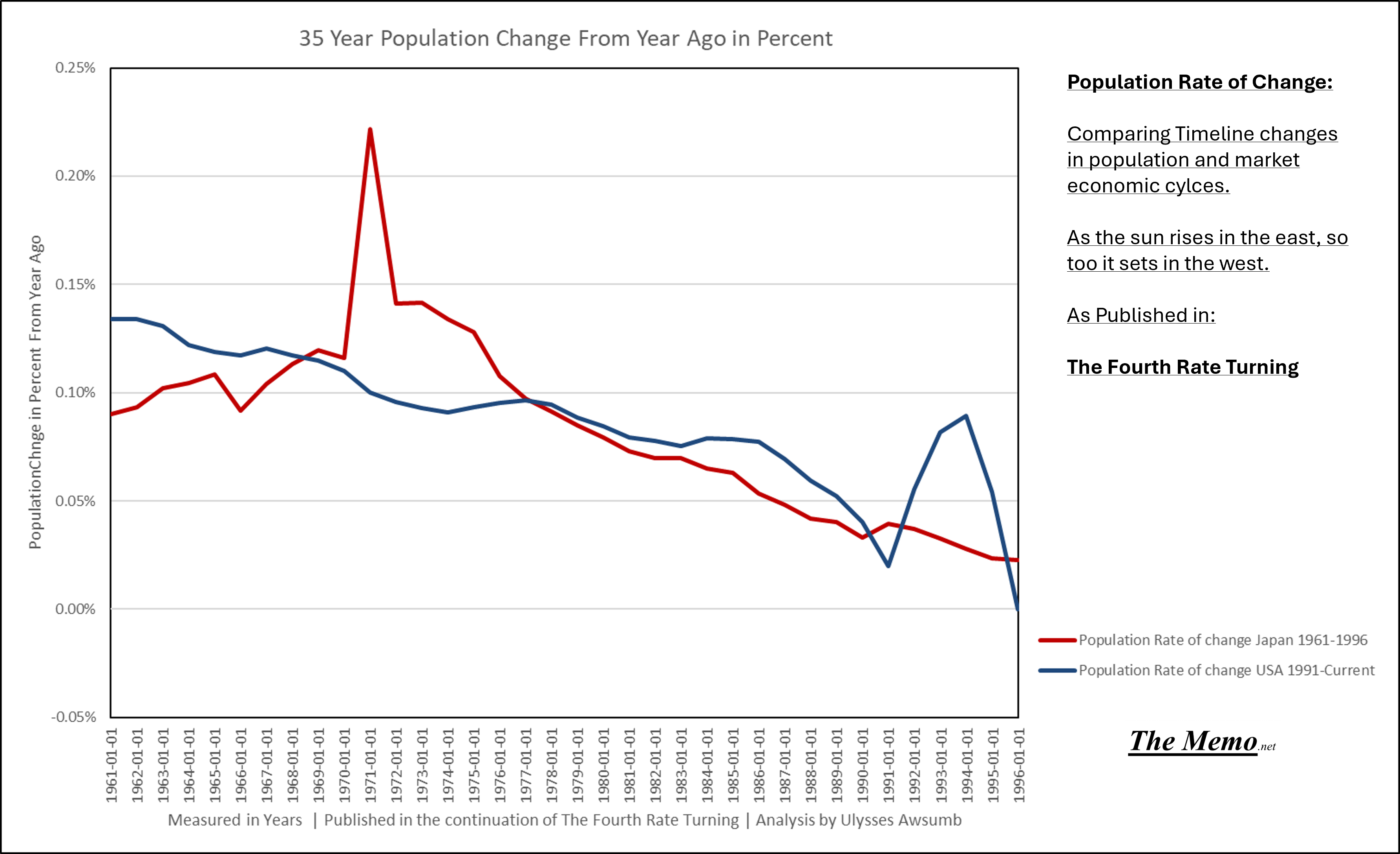
And for those who claim that’s cherry blossom picking: an extended timeline.
Currency
Economics is the study of: The Production, Distribution and Consumption of Goods and Services (and money). What’s in your wallet?
The Yen should appreciate against the dollar from here, if the past is any lesson.
And here’s the recent past, from which the first EFFing study was conducted.
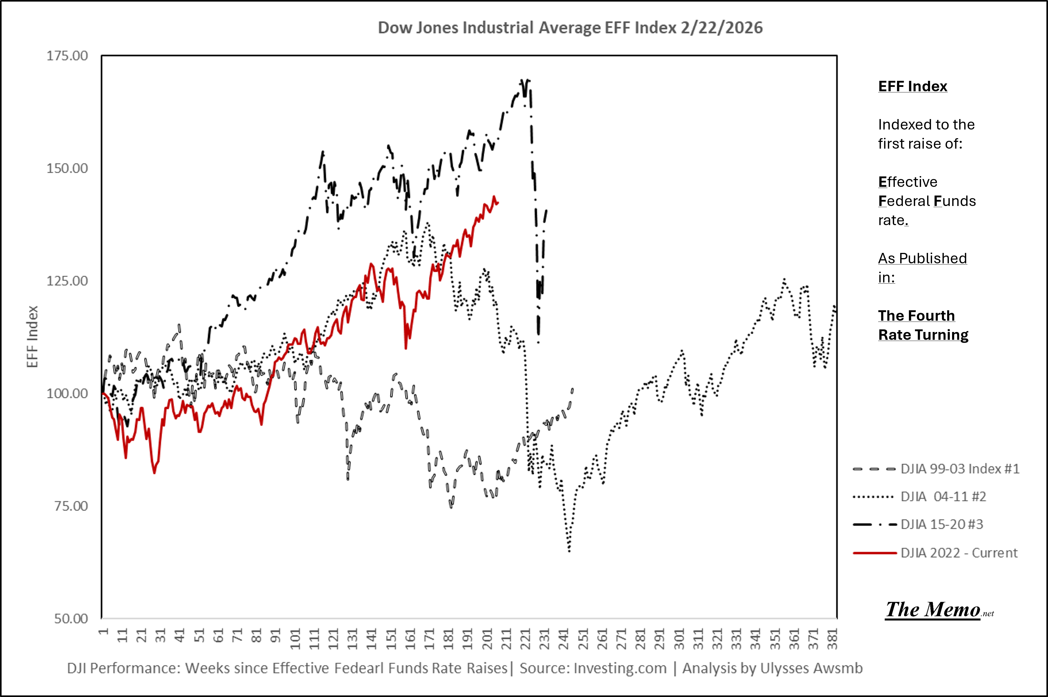
Other Indices
The Dow Jones Industrial Average in the 21st EFFing Century.
Gold
Pictures are allowed to speak for themselves.
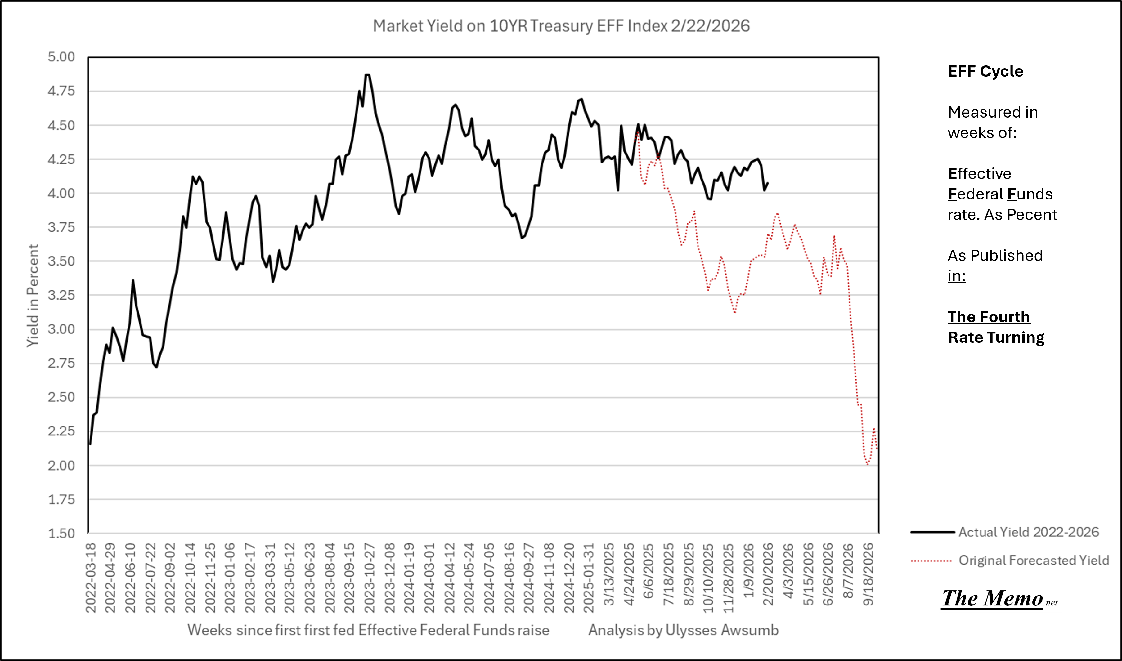
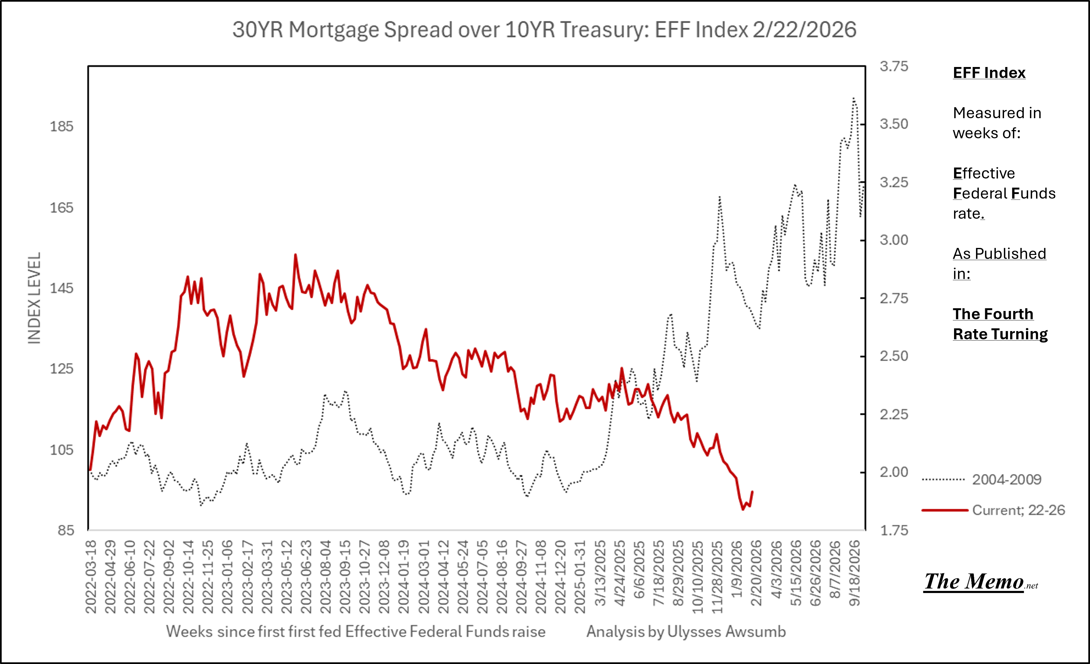
Yields
This kinda is like watching paint dry. Also, why the EFF do we tolerate such a small yield on lending the government even more money?
(S)Mortgage board when you have indigestion.
Contract(ion) in Contract(ing)
Residential units under construction have contracted by 28% since the shift in EFFing rates began. While that’s not a small number, it’s worth remembering that contraction is coming off a peak of ALL TIME HIGH in units under construction. As in the most amount of housing being built in recorded history.
Here’s the contraction in comparison to other cycles:
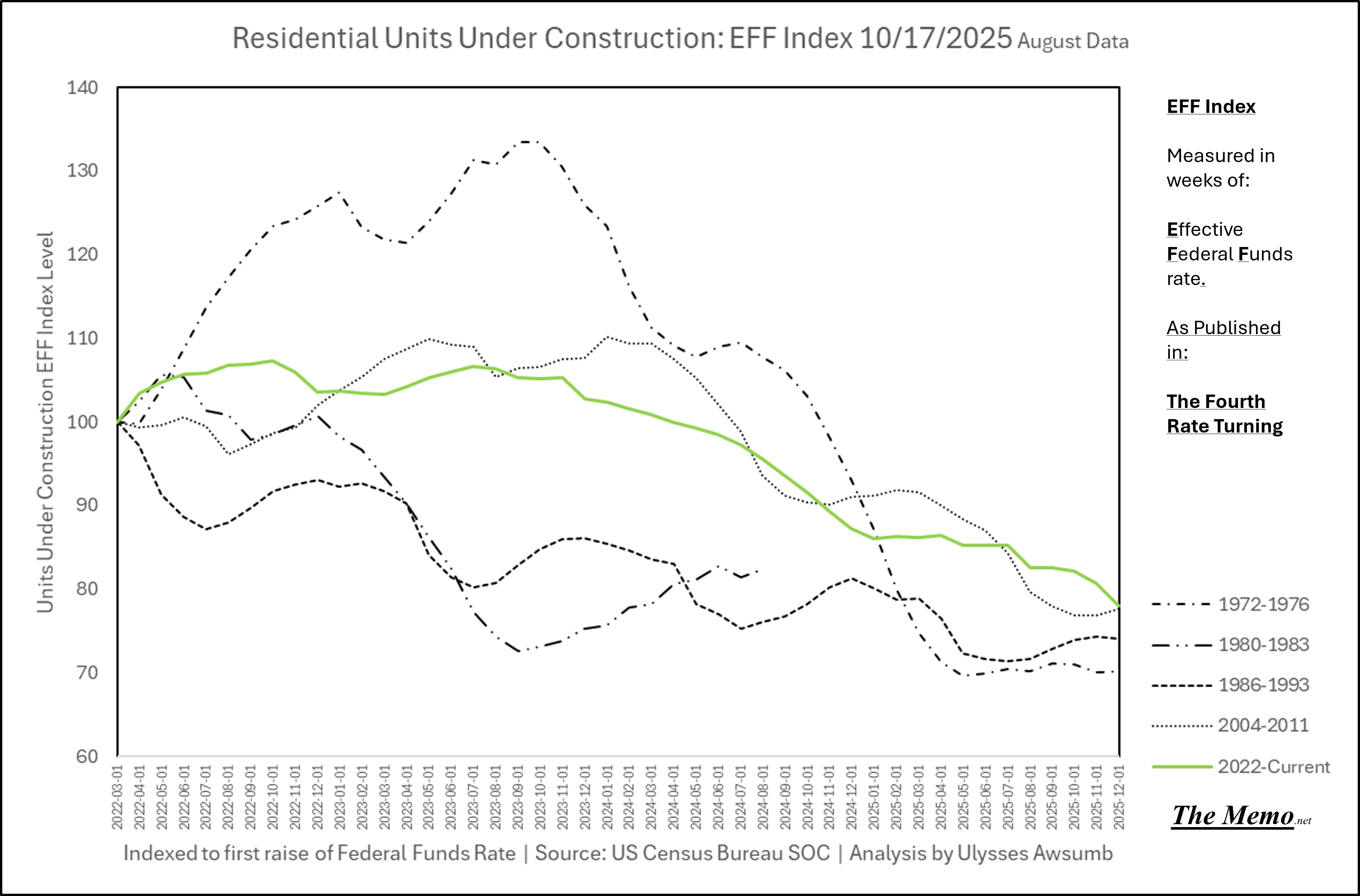
And here it is again in terms of the time periods it most resembles. In fact, it matches exactly through 46 months, where we were 46 months into the 2008 contraction.
All that contraction while the number of “Spec” homes for sale keeps growing. Just one vertical bar away from tying the all time high.
A Reminder: A “Spec” home is one that’s built on “speculation” that it will sell.
Here’s all the recorded, permitted “spec homes” for sale in government cheese chart format.
Breakfast
This is just the change in cost of the American breakfast staples since the fourth rate turning began.
And the cumulative price change over said time, in percent.
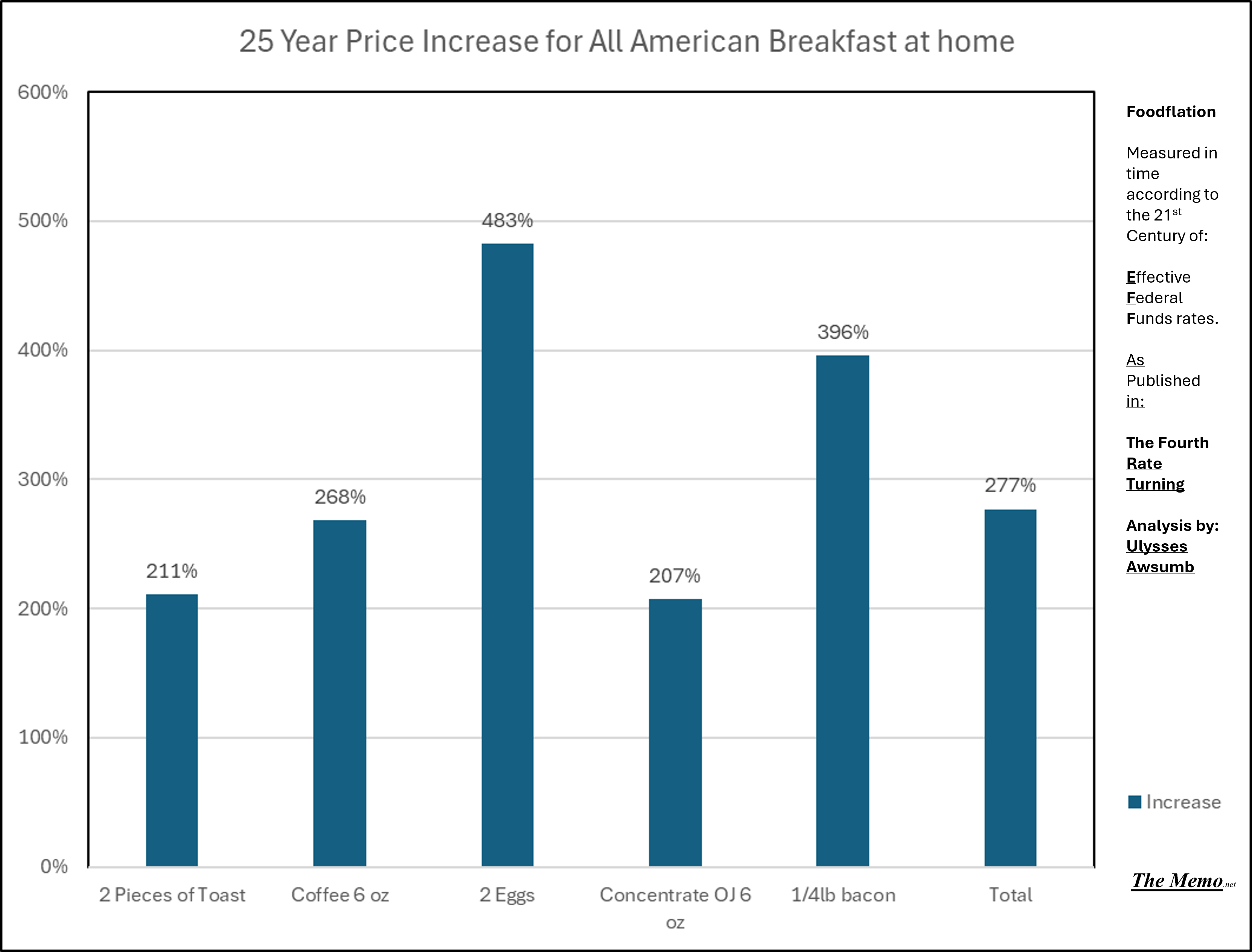
10.65% increase year over year for breakfast annualized in 26 years? Tell the “proletariat” to eat cake at your own peril.
It’s all just about the cost of money
The flip side, because there is a flip side to everything:
Markets tend to recover, resets in basis pricing are great opportunities to grow.
But it’s “Winter”. Like we haven’t lived through winter before? Store your nuts, help others store their nuts. Do good, be good, enjoy the ride.
There are so many places in the US that are growing, there’s ample opportunity to build housing, businesses and more.
Margin power disappearing? Find way’s to lower actual costs, deliver better service, products and terms.
Turning Japanese? As if there weren’t still heavily populated areas with ample opportunity in said physically beautiful nation. And while internally selling $1 homes to people willing to invest may seem counter to growth, what better way to attract the capable and willing than offering an inexpensive “home” so long as one renews its usefulness. Plenty of said opportunity here too.
Mitigate risks, maximize outcomes and returns. Live. Today is just another day. Life goes on. It’s not like we haven’t been here before.
Today in EFFing Time:
It is:
Just another day that ends in Y. We’ve been here before. 15 times at least. Even if it is winter.
Fourscore and………..seven minutes ago... we, your forefathers, were brought forth upon a most excellent adventure conceived by our new friends, Bill... and Ted. These two great gentlemen are dedicated to a proposition which was true in my time, just as it's true today. Be excellent to each other. And... PARTY ON, DUDES!
-Abraham Lincoln: supposedly
Yes!!